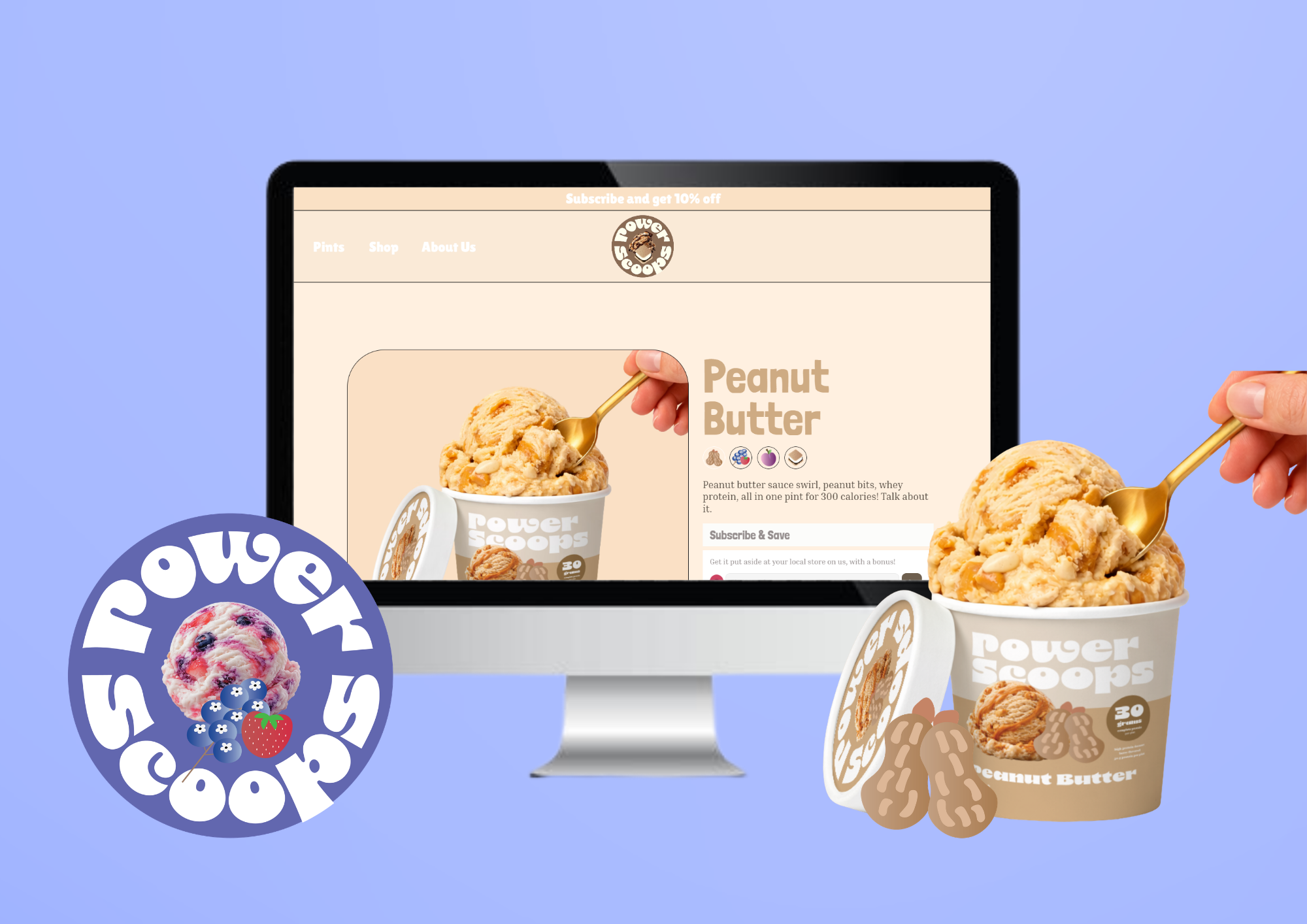
Power Scoops
Website Design
Tools
Framer, Adobe Illustrator, Adobe Animate
Deliverables
User Research, User Personas, Logo, Icons, Motion Design, UI Kit, Wireframes, Prototypes
Power Scoops
Website Redesign
About
Power Scoops is a brand dedicated to creating nutritious, protein-packed ice cream made with natural ingredients. Our goal is to bring together the indulgent taste and creamy texture of traditional ice cream with the added benefits of protein and thoughtfully selected ingredients. Each pint is designed to satisfy your sweet tooth while providing a convenient source of protein, making Power Scoops a delicious option for dessert, a post-workout treat, or whenever you’re craving something sweet.
Problem
Power Scoops needs a website to create a strong online presence and give customers a central place to discover and understand the brand. Because Power Scoops combines ice cream with protein and natural ingredients, customers need an easy way to understand what makes the product different from traditional ice cream.
Goal
As a designer, my primary goal is to create a visually compelling and cohesive website that not only captures the essence of the brand but also resonates with its target audience. Through thoughtful branding and strategic web design, I aim to establish a strong visual identity that enhances the overall aesthetic appeal and leaves a lasting impression on visitors.
A website can increase brand awareness and credibility by showcasing Power Scoops’ personality, products, flavors, ingredients, nutritional information, and mission in one place. It also gives potential customers somewhere to go after discovering the brand through social media, advertising, packaging, or word of mouth.
01. User Research
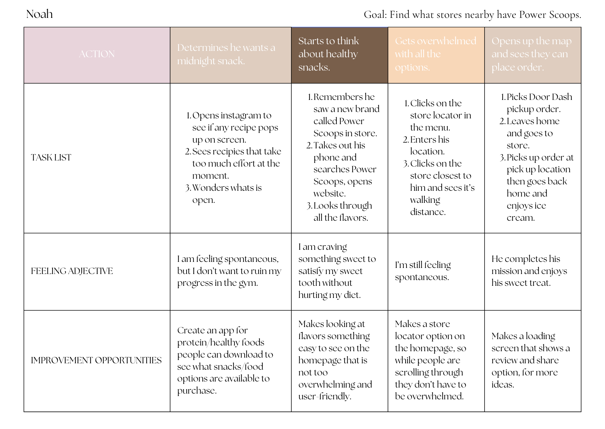
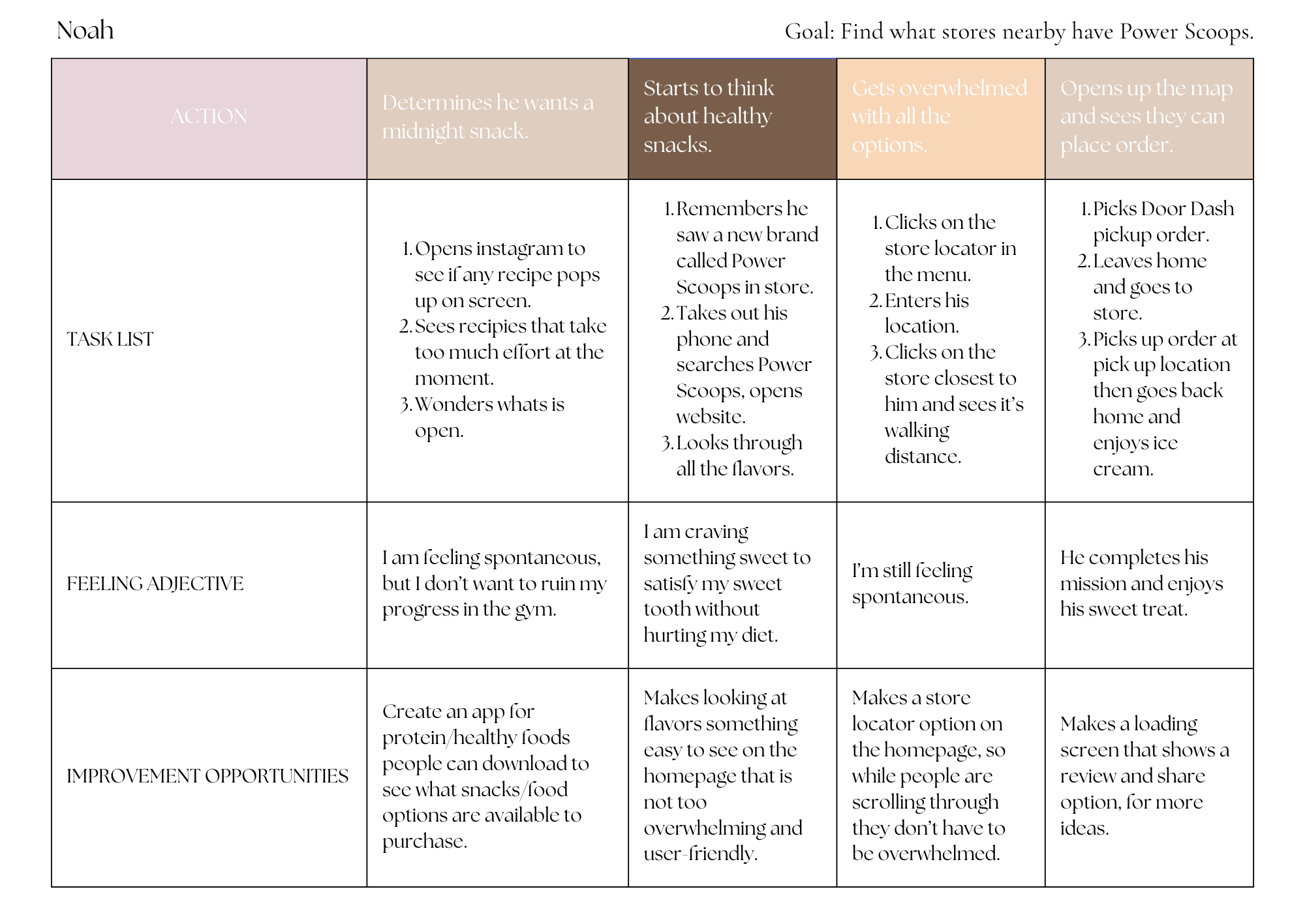
This user journey map shows how Noah goes from wanting a late-night snack to finding and purchasing Power Scoops. He wants something sweet but also wants an option that fits with his fitness and nutrition goals. After looking for ideas on Instagram and finding the recipes too complicated, he remembers Power Scoops and visits the website. He browses the flavors and then uses the store locator to find the closest location where the product is available. The journey highlights how the website can make discovering the brand, exploring products, and finding a place to purchase Power Scoops much easier and more convenient.
Accessibility and ease of use are important parts of this journey because Noah can become overwhelmed when there are too many choices or steps. The website can address this by keeping navigation simple, displaying flavors clearly, and placing the store locator somewhere easy to find, such as directly on the homepage. Accessibility can also be improved through readable text sizes, strong color contrast, descriptive labels and alt text, keyboard-friendly navigation, and buttons that are large and clearly labeled. These choices make the website easier to navigate for people with different visual, motor, or cognitive needs while also creating a faster and less overwhelming experience for all customers.
User Steps
Key Takeaways
The customers wants something fast and easy, this should also be included in the website design. Having the website be accessible as the ice cream brings more attention.
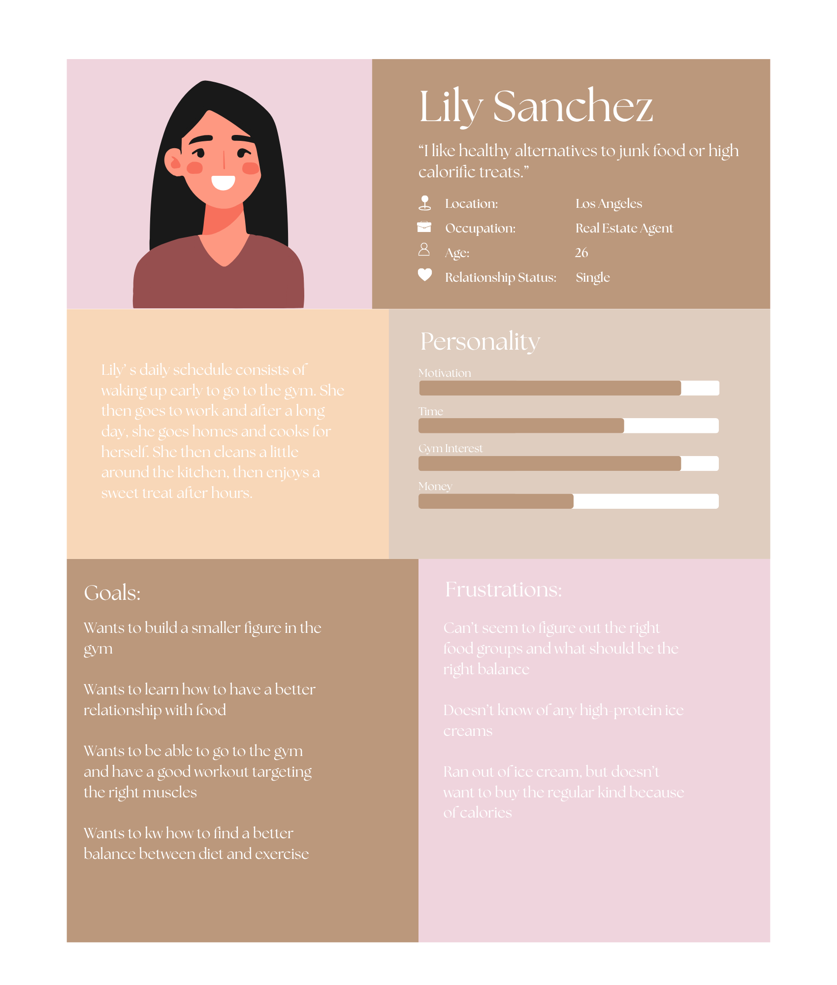
User Personas + Empathy Map
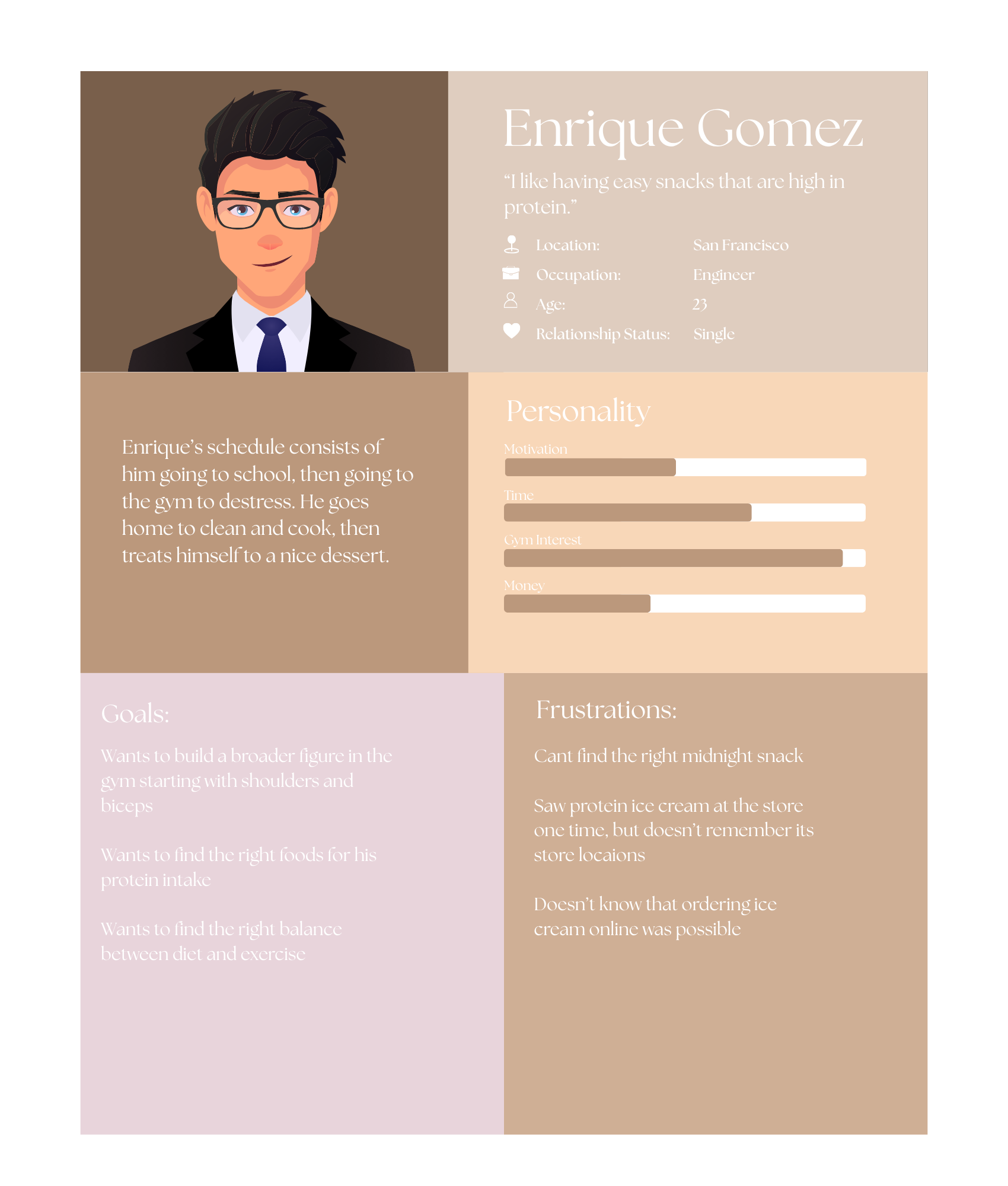
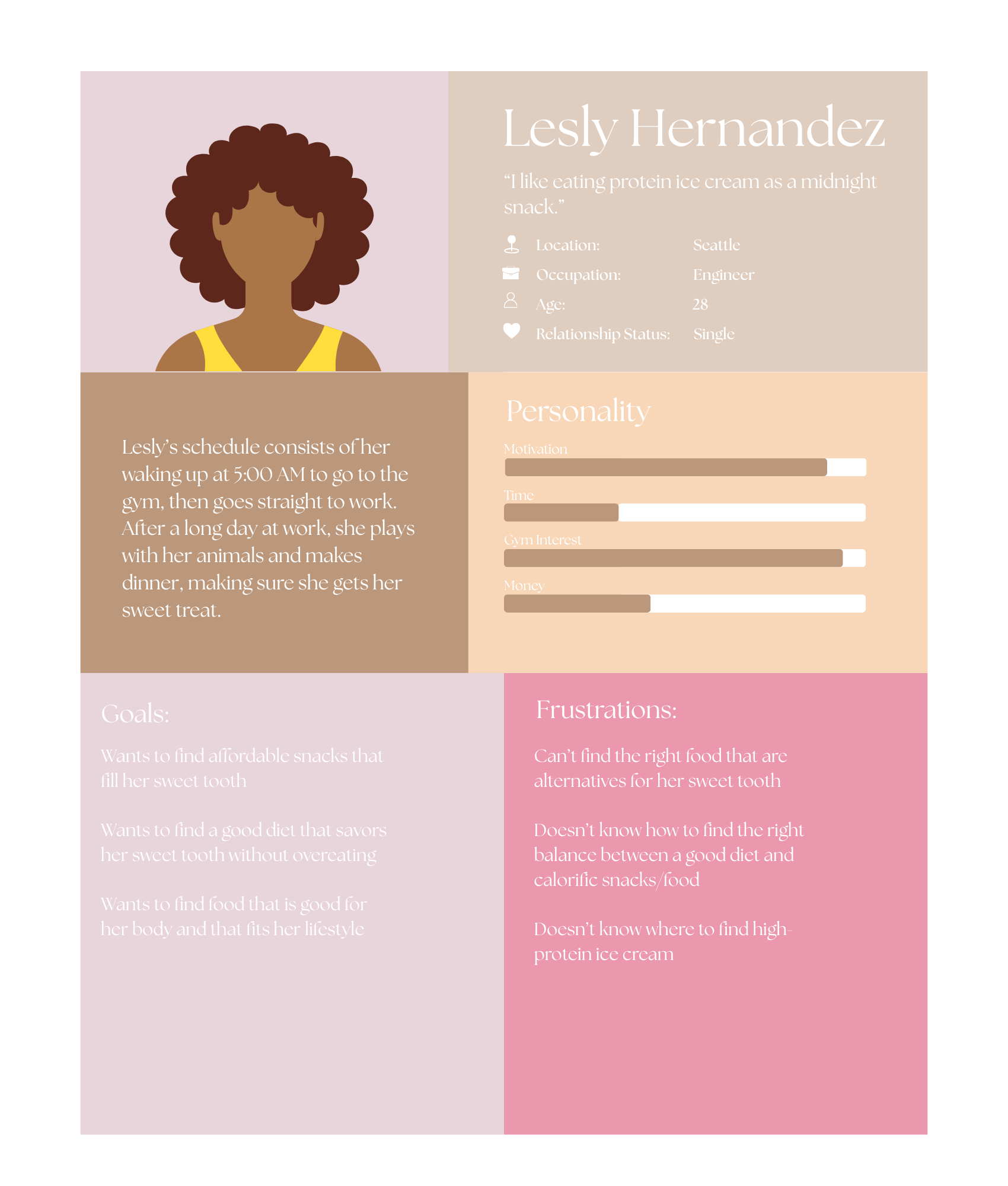
Key Takeaways
All users have two things in mind when looking for ice cream; nutrition and accessibility. This brings up the fact of how the brand works and it’s affect on others.
Empathy Map
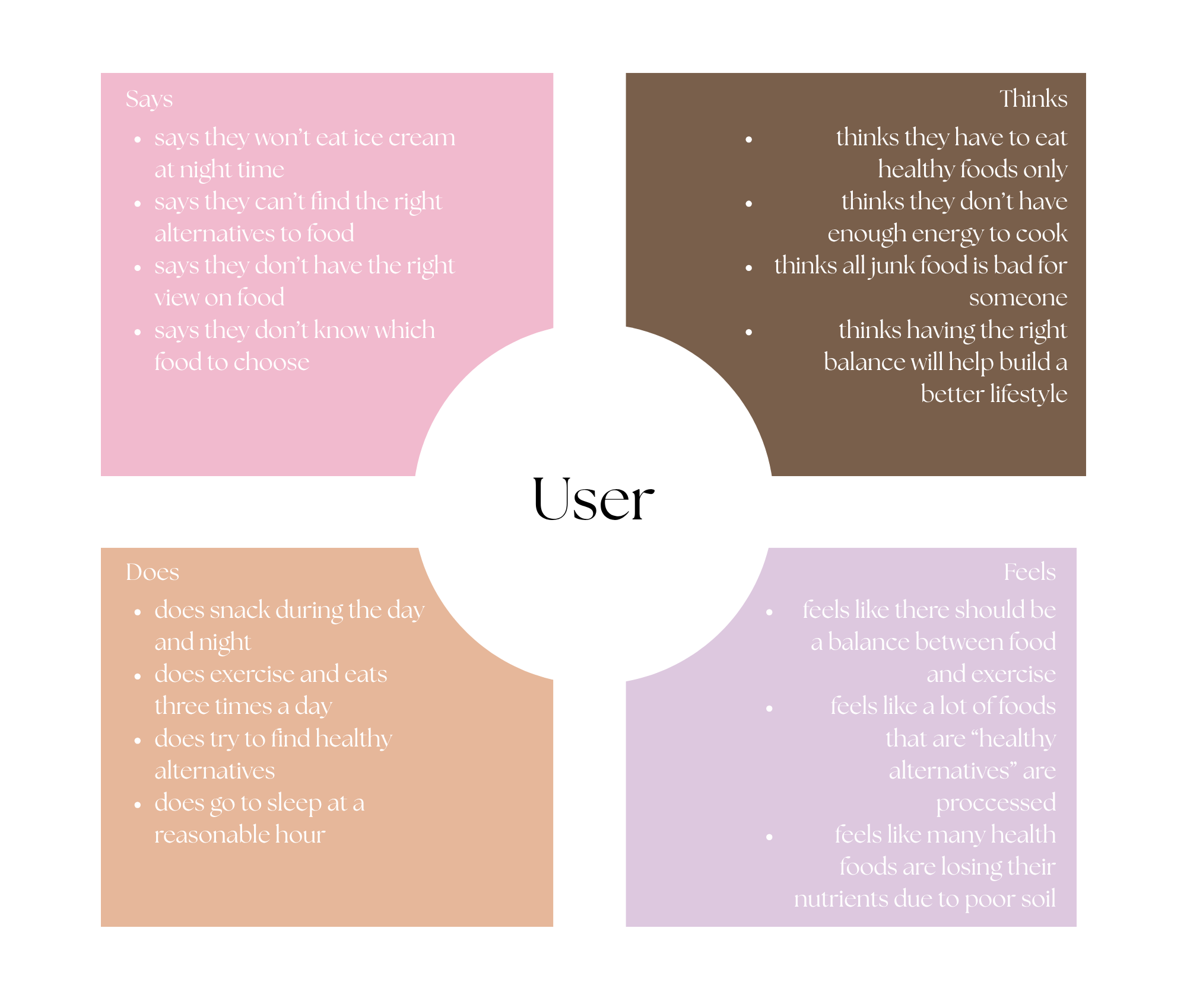
An empathy map is a visual tool designed to help gain deeper insight into the user's thoughts, emotions, and behaviors. By breaking down the user's experience into four key quadrants—what she says, thinks, does, and feels—this map allows for a more comprehensive understanding of her motivations, pain points, and desires.
The foundation of my research for Power Scoops focused on accessibility and providing information quickly and easily. Because Power Scoops is a protein ice cream brand, customers may want to know important information such as protein content, ingredients, nutritional benefits, available flavors, and where they can purchase the product. My research showed that this information should be presented clearly and should not require users to search through multiple pages or complete unnecessary steps. The goal is to create an experience where customers can quickly understand what Power Scoops offers and determine whether the product fits their needs.
Research Key Findings
Accessibility also influenced how I approached the overall website experience. The research emphasized creating simple navigation, readable information, clear buttons, organized product choices, and an easy-to-find store locator. Rather than overwhelming users with too much information at once, the website should guide them toward the information they need as efficiently as possible. Making the site accessible and easy to understand benefits users with different abilities and needs while also improving the experience for everyone. Ultimately, the research helped establish a website strategy centered around clarity, accessibility, convenience, and speed.
Now that my research has been conducted and I’ve synthesized my data, I have to analyze the problem to make sure it is validated, meaning: is it important and do users actually experience it?
I have developed a clear understanding of my ideal user persona by creating an empathy map that highlights their experiences, thoughts, emotions, and behaviors while navigating the website. This process allowed me to pinpoint key pain points, motivations, and needs that shape their interaction with the platform. Additionally, I have gathered insights from other users by conducting interviews, surveys, or usability testing to gain a broader perspective on how different users engage with the website. By combining these findings, I can identify common patterns, validate assumptions, and refine the user experience to better align with their expectations and needs.
Problem
How can I update the website with a refreshed interface that maintains its existing design language while improving functionality through enhancements in organization and interactive elements?
Problem Validation
02. Branding/Visual Identity
This mood board sets the visual direction for the project with a retro, fun, and playful aesthetic that reflects the personality of the Power Scoops brand. The bright colors and energetic style capture the playful feeling associated with ice cream while giving the brand a unique identity. The concept also brings a sense of color and excitement into the gym environment, a space often dominated by grey, white, and neutral tones. By combining fitness with the colorful and nostalgic personality of ice cream, the visual direction makes Power Scoops feel energetic, approachable, and fun.

Style Tile/Mood Board
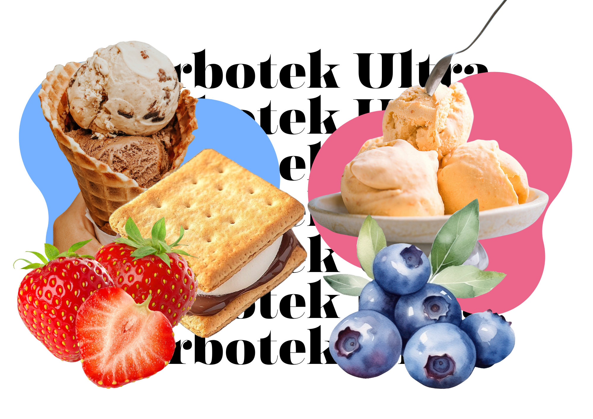
This mood board sets the visual direction for the project with a retro, fun, and playful aesthetic that reflects the personality of the Power Scoops brand. The bright colors and energetic style capture the playful feeling associated with ice cream while giving the brand a unique identity. The concept also brings a sense of color and excitement into the gym environment, a space often dominated by grey, white, and neutral tones. By combining fitness with the colorful and nostalgic personality of ice cream, the visual direction makes Power Scoops feel energetic, approachable, and fun.
Package Exploration
Logo & Packaging
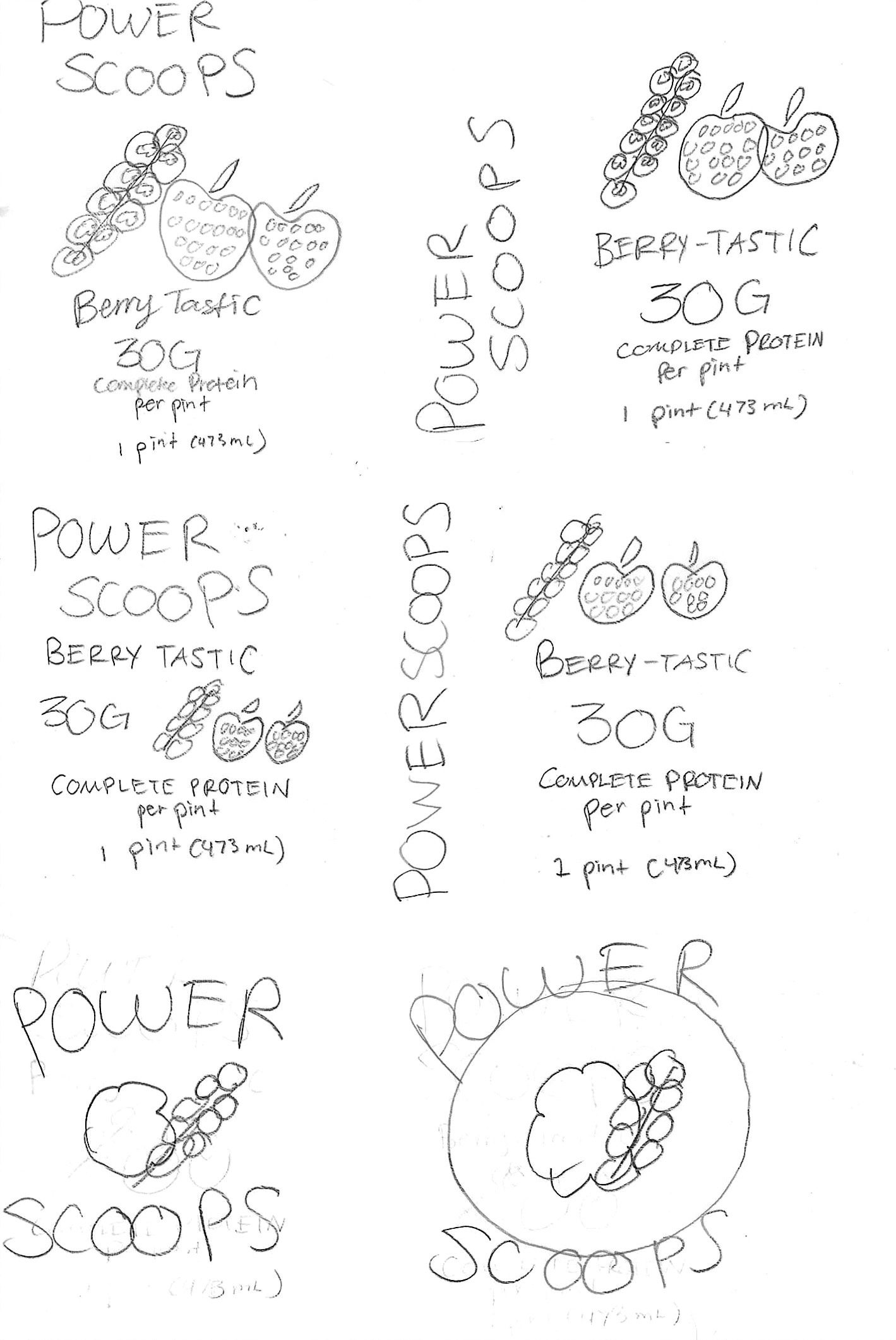
Given that there is no logo and packaging I decided to make it from scratch. The logo was very difficult to build, but I got the retro, fun style I was aiming for. The packaging was difficult as well, but I ended up choosing the right pattern for the theme.
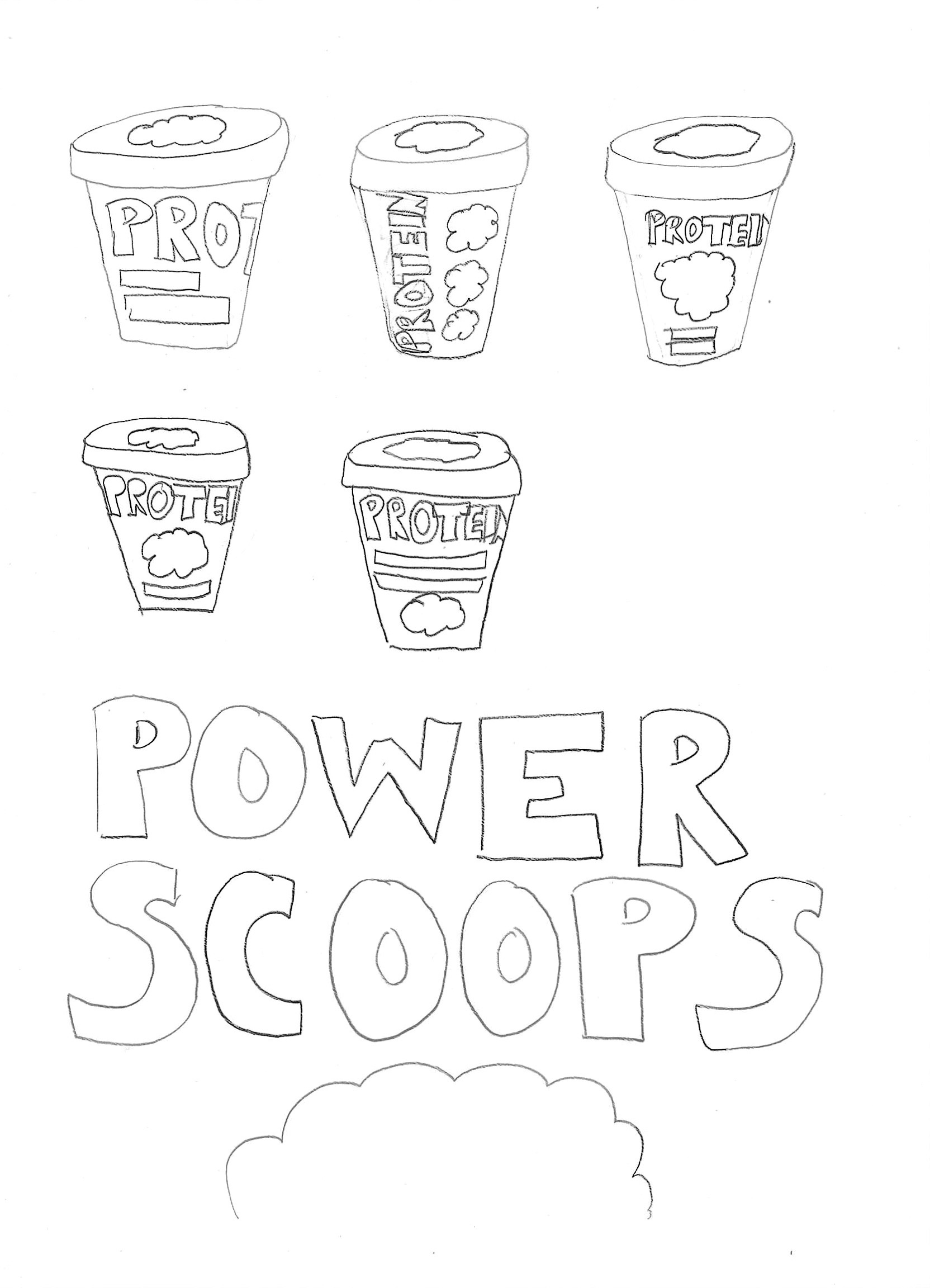


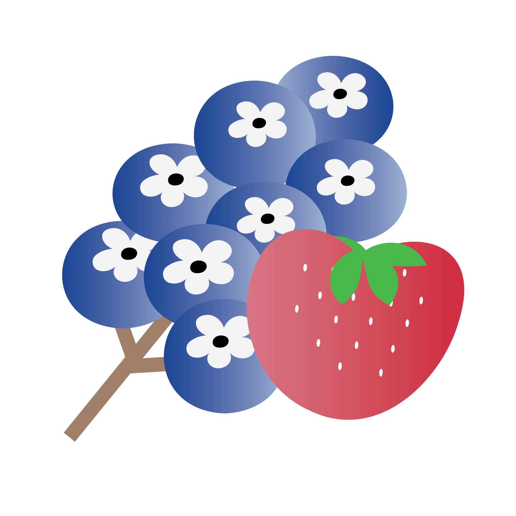
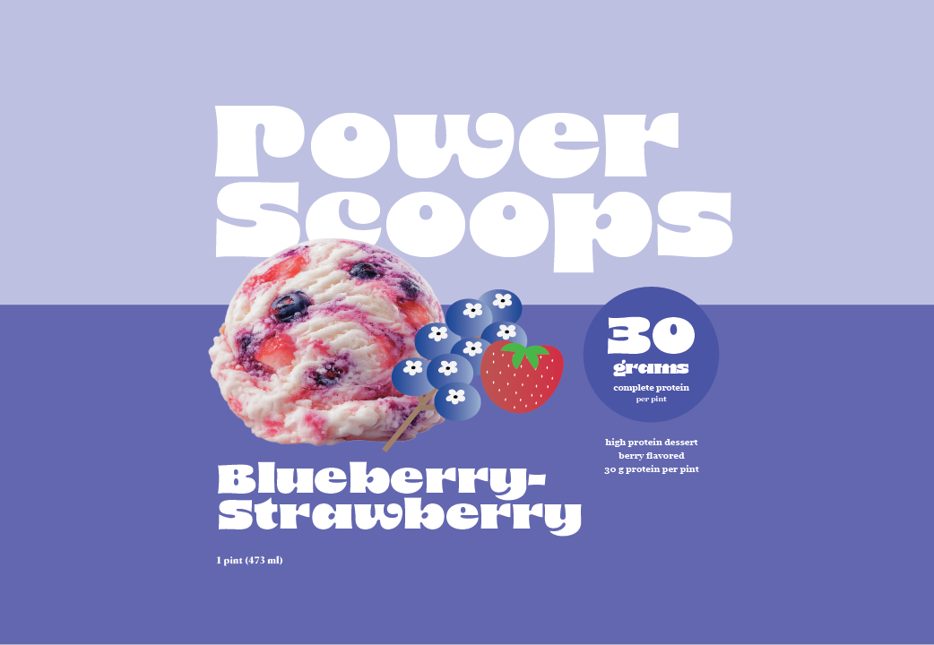
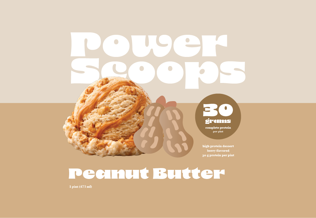
For the packaging I decided to create these illustrations. I have four flavors; blueberry-strawberry, peanut butter, plum, and smore’s. For the style: I chose a clean and modern illustration style with a gradient. I believe these bring attention to the viewer, but will also keep the rest of the packaging organized since it’s a playful, fun perspective, it brings natural contrast.
Logo Exploration
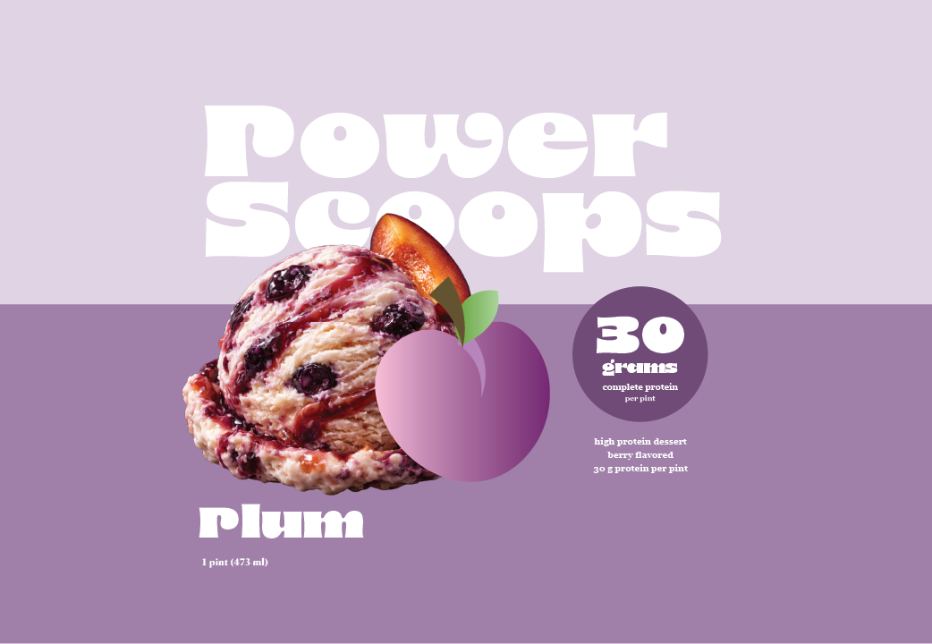
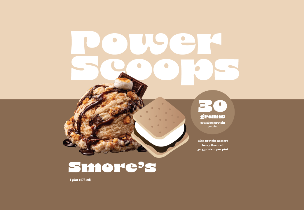
For the finalized packaging, I created a duo-tone background with the colors of the flavors. I added an ice cream scoop image of the ice cream and the illustrations I previously mentioned. For the font, I chose a fun, retro type to match the theme as well as to point out how much protein is in the ice cream. For the other small, but equally important details I used a san-serif type.
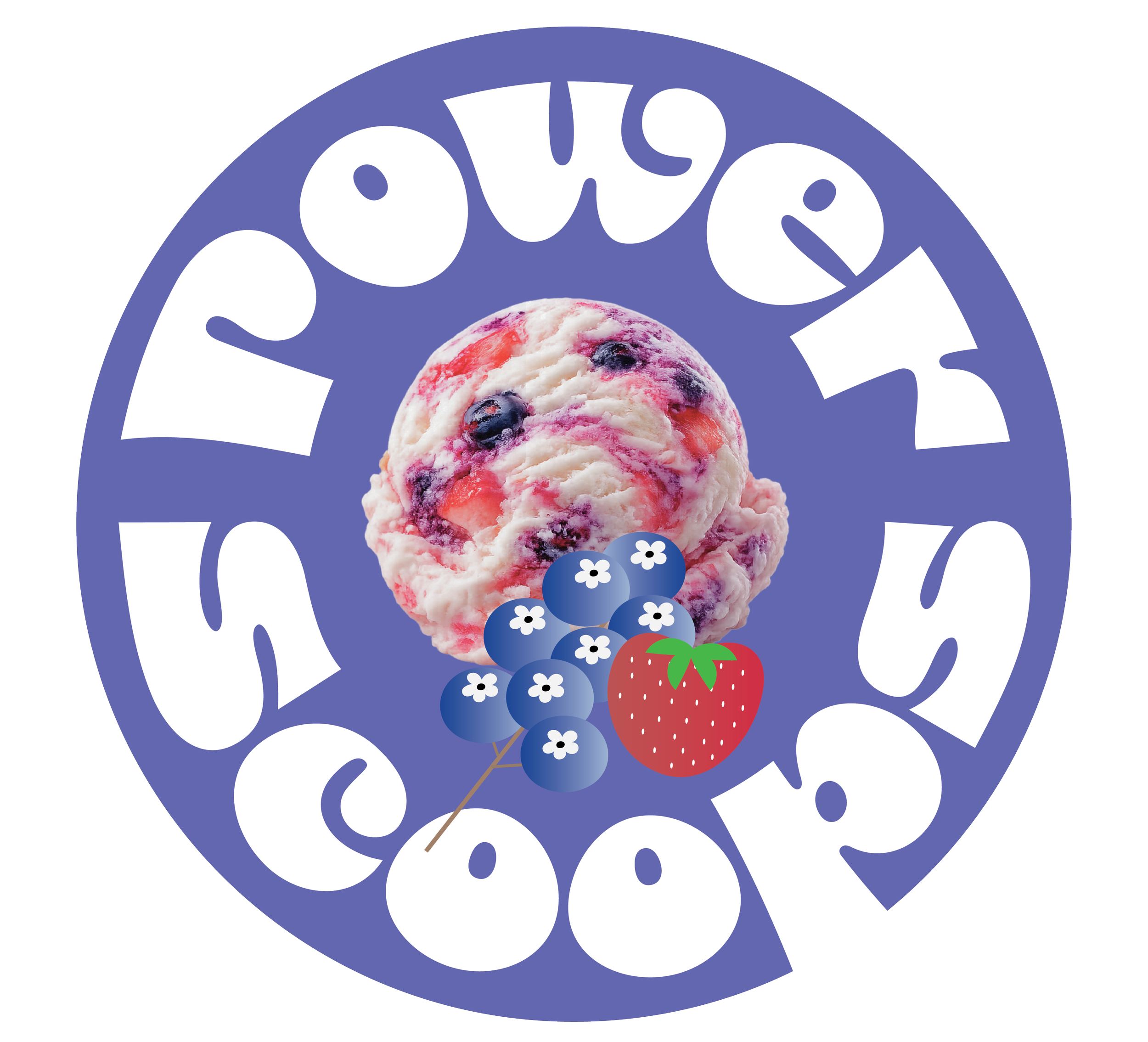
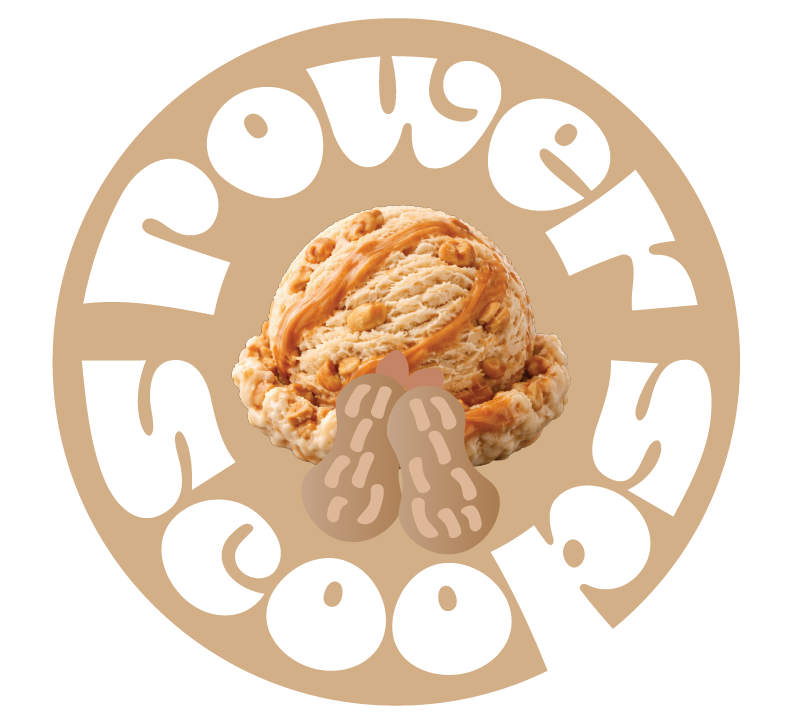
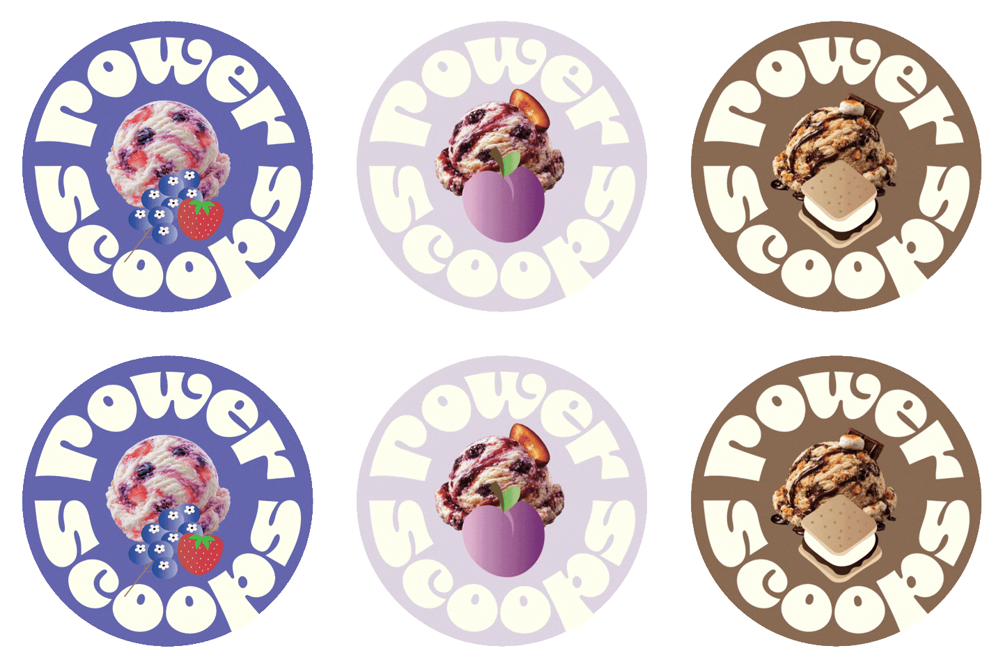
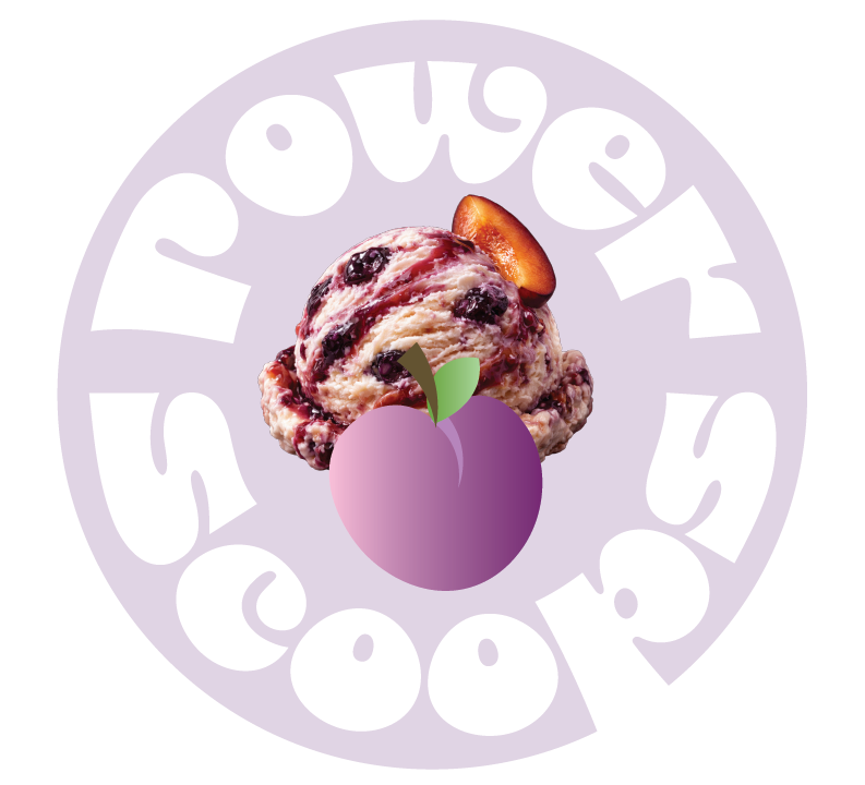
For the finalized logos I created a circle logo with the illustrations and ice cream I have on the packaging. I think this became a great staple for the brand. For the final logo, I animated them together to make a cute gif and have them work as a unit.
UI Kit
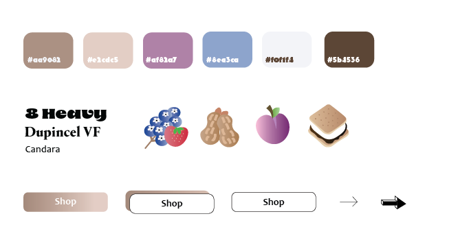
I created a UI Branding Kit that outlines the visual identity of the flower store: color schemes, typography, illustrations, and other design elements. For typography, I chose a fun, retro to express the playfulness nature of the brand. Since this is an ice cream brand, I wanted the design to instill a sense of 90’s ice cream playfulness and nostolgia.
I chose a color palette of the colors of the ingredients of the flavors to convey creativity, nostolgia, and playfulness. In addition, I added bright accent colors for buttons, interactive elements, and links, making them vibrant and standing out. This improvement to usability is reflected in the design, thus, enabling a bright and cheerful interaction for the users.
03. Website Design
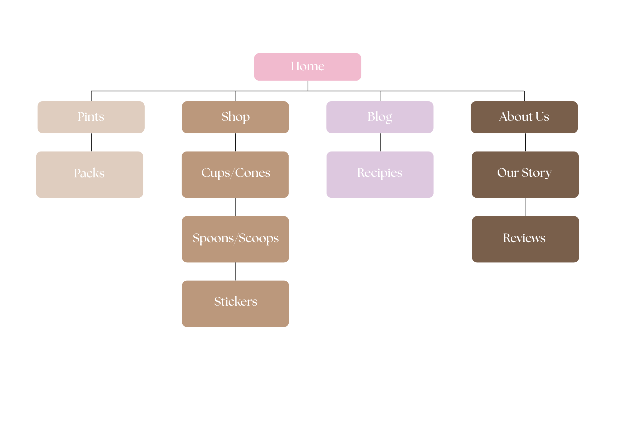
Site Map
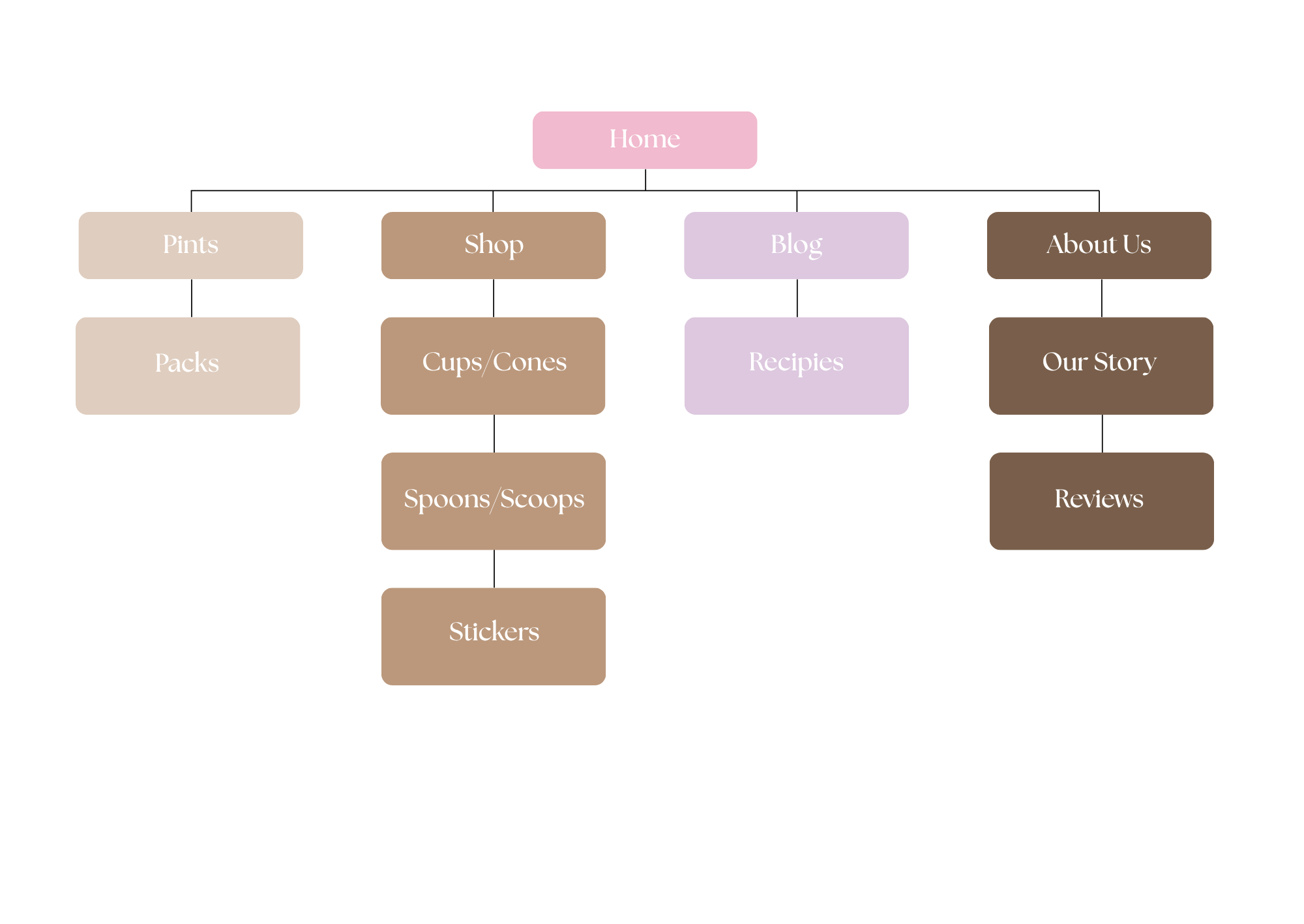
Creating this site map was somewhat challenging due to the numerous categories for occasions and flowers. To improve clarity and organization, I carefully selected the most important categories and merged some that overlapped, ensuring the choices were more distinct and user-friendly. The other sections of the site map were more straightforward to structure, as their purposes were clearer. However, I also had to remove certain existing pages that didn’t justify being standalone sections. These pages contributed to unnecessary clutter in the navigation, and consolidating them helped create a more streamlined and intuitive browsing experience
Low Fidelity Wireframes
Desktop
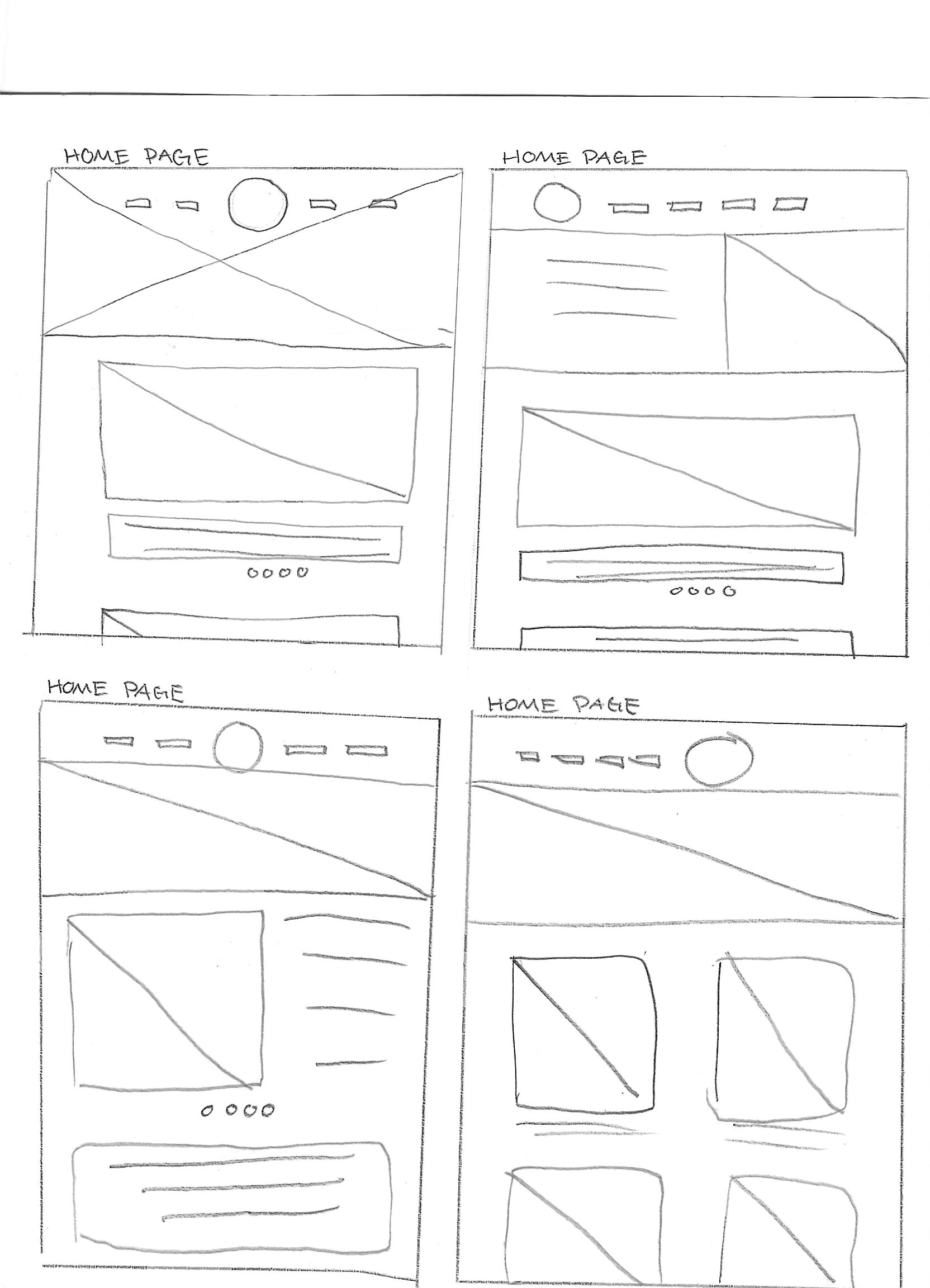
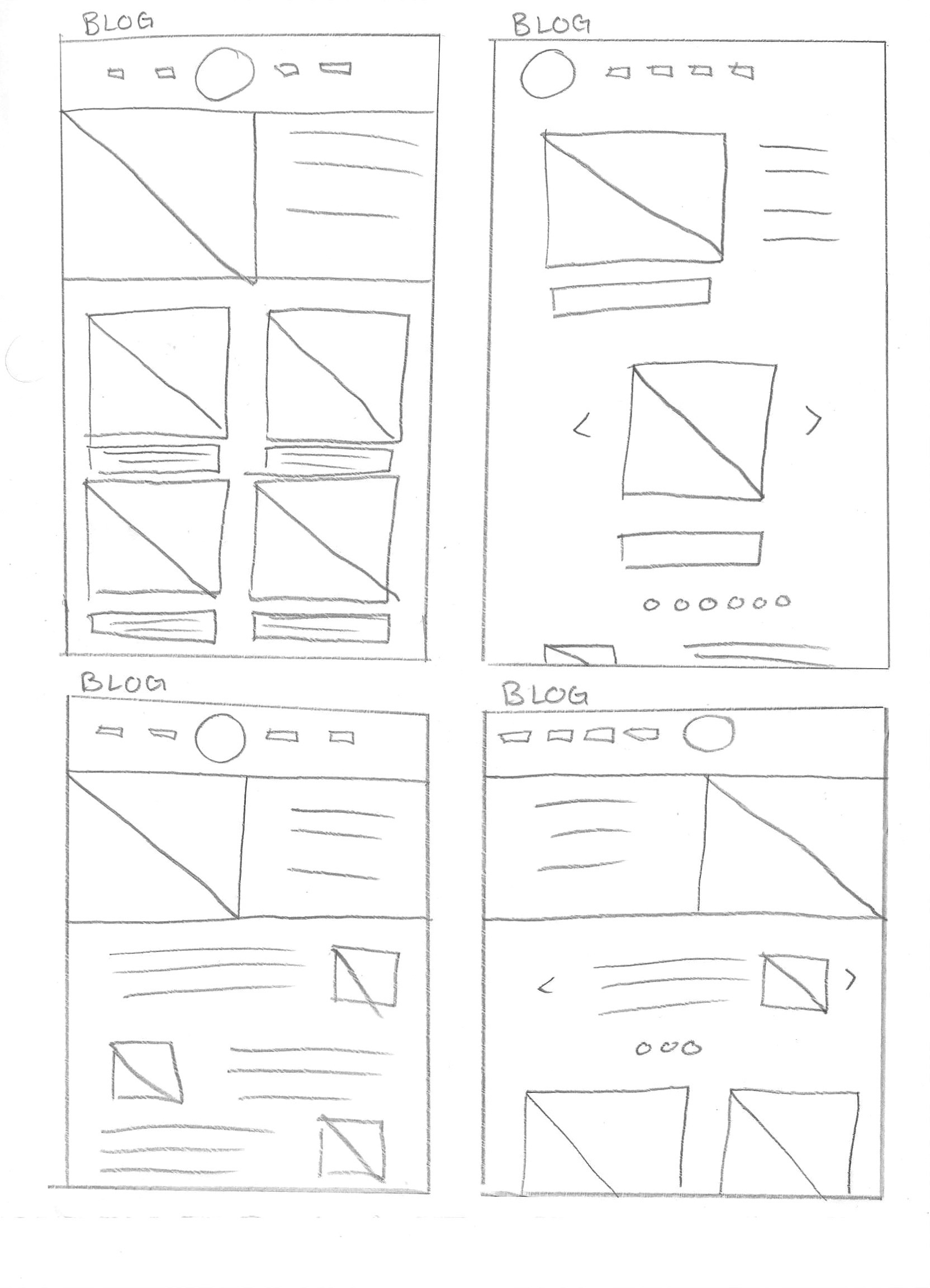
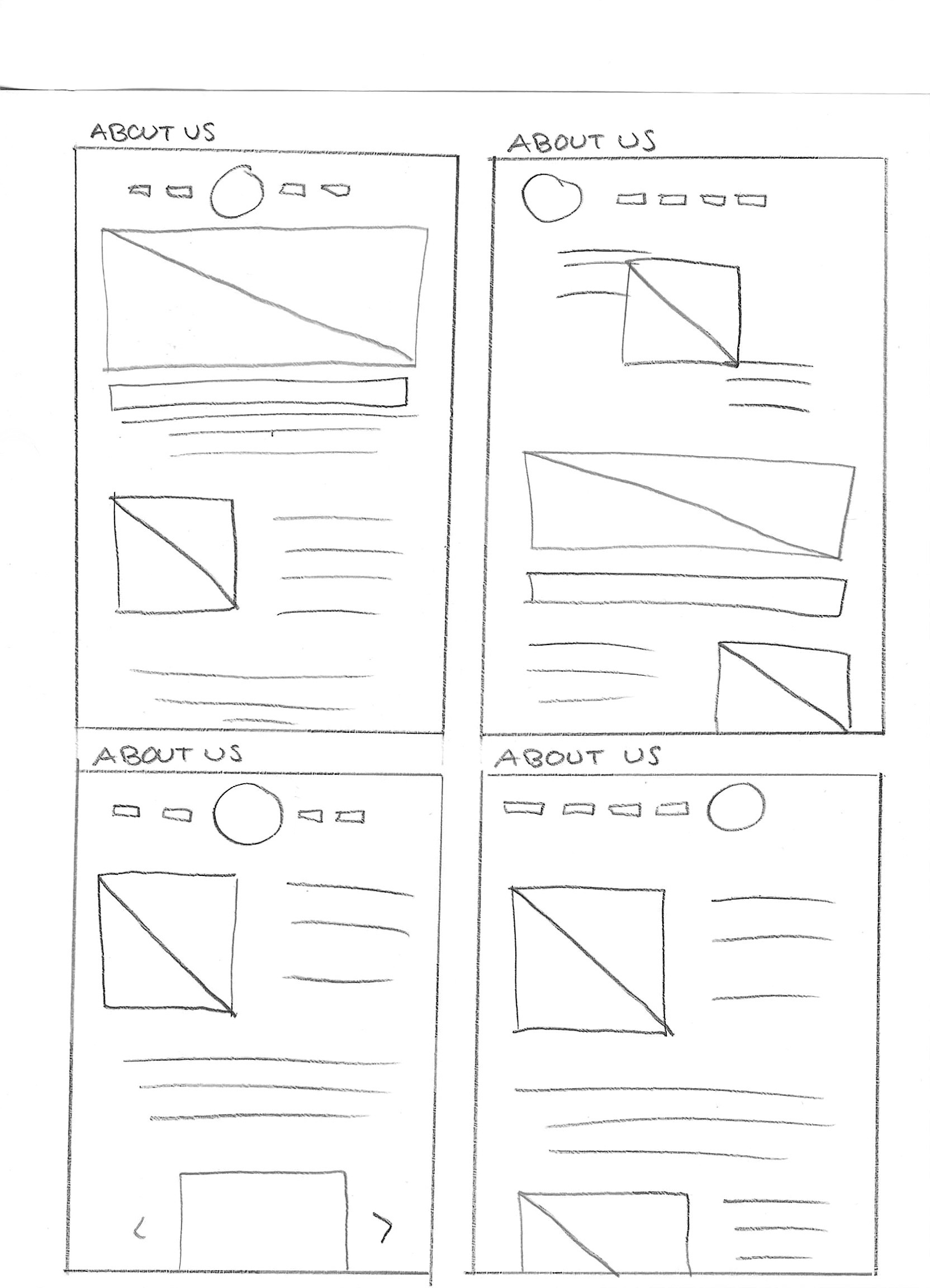
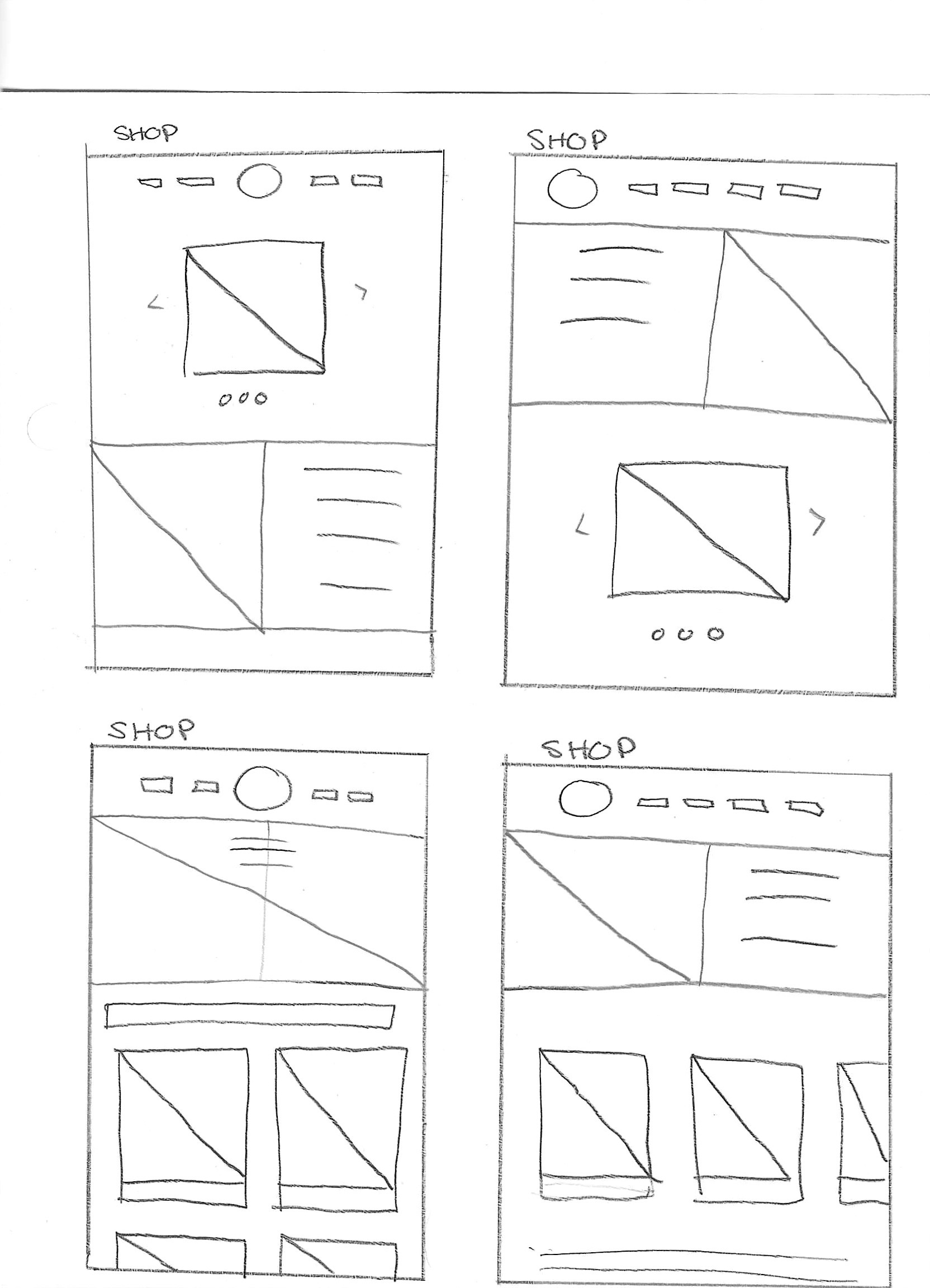
These are very rough lo-fi wireframes, intentionally kept simple to allow for greater flexibility when refining the UI in my high-fidelity wireframes. By keeping them rough at this stage, I give myself more creative freedom to explore different design possibilities without being too constrained by details too early in the process. However, despite their rough appearance, these wireframes serve as a strong foundation, clearly outlining the core structure and essential features that will be carried into the final prototype.
Mobile
High Fidelity Wireframes
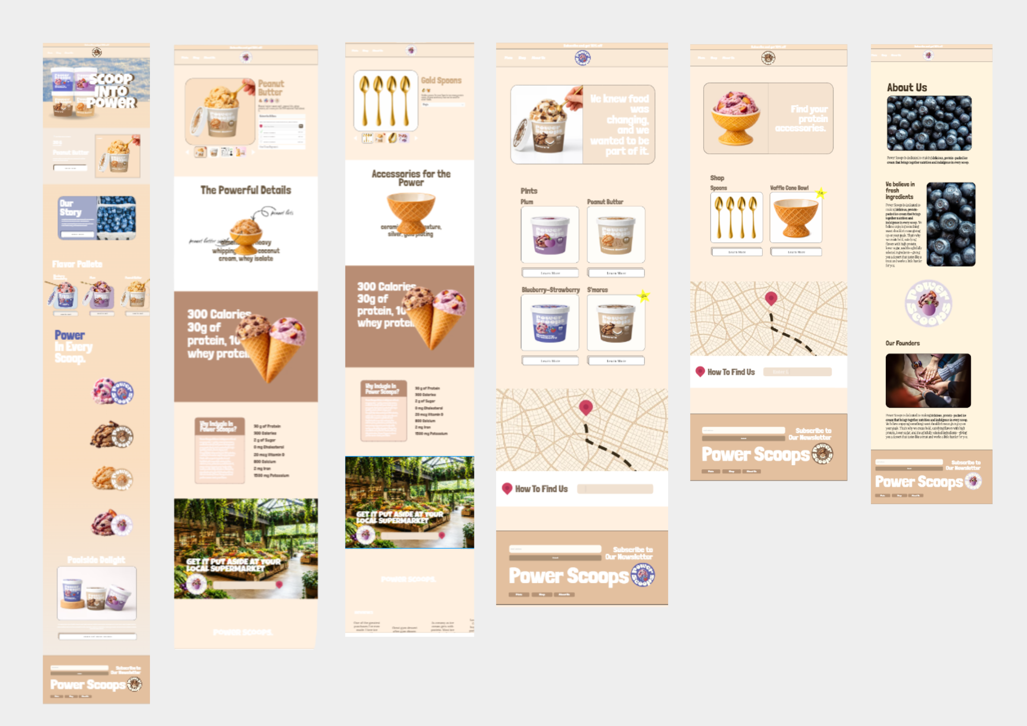
I created six pages of high fidelity wireframes. It was fun to get the all the pictures and create animations to showcase the nutritional part of the brand as well as the accessibility. Seeing all the pages together goes to show how a retro style really can bring attention to a viewer who has seen the same type of gym meals on social media and in-store.
Prototype