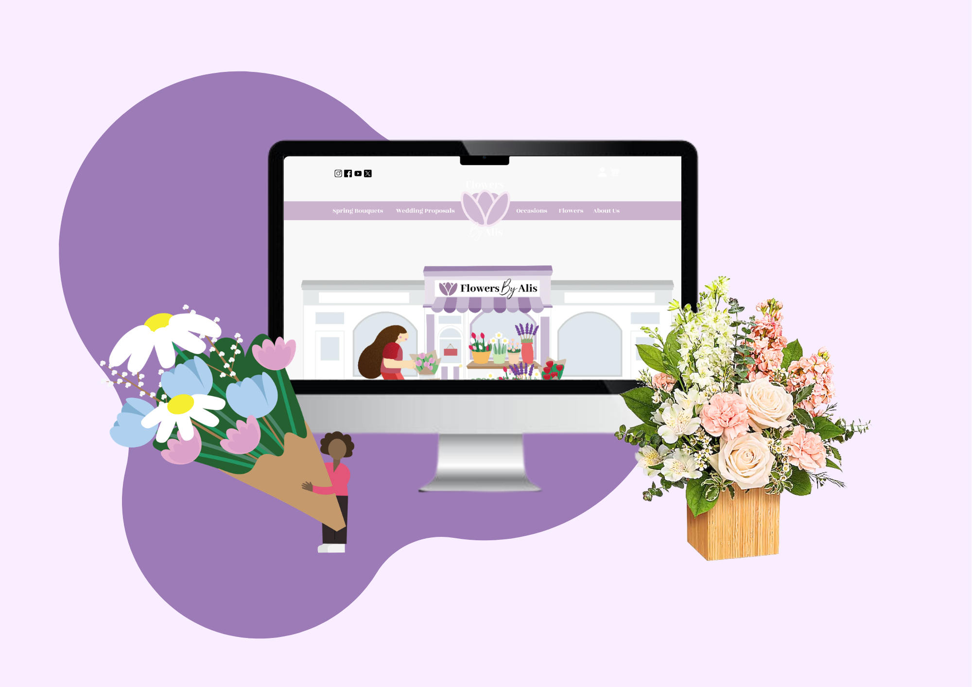
Flowers By Alis
Website Redesign
Tools
Figma, Adobe Illustrator, Adobe Animate
Deliverables
User Research, User Personas, Logo, Icons, Motion Design, UI Kit, Wireframes, Prototypes
Flowers By Alis
Website Redesign
About
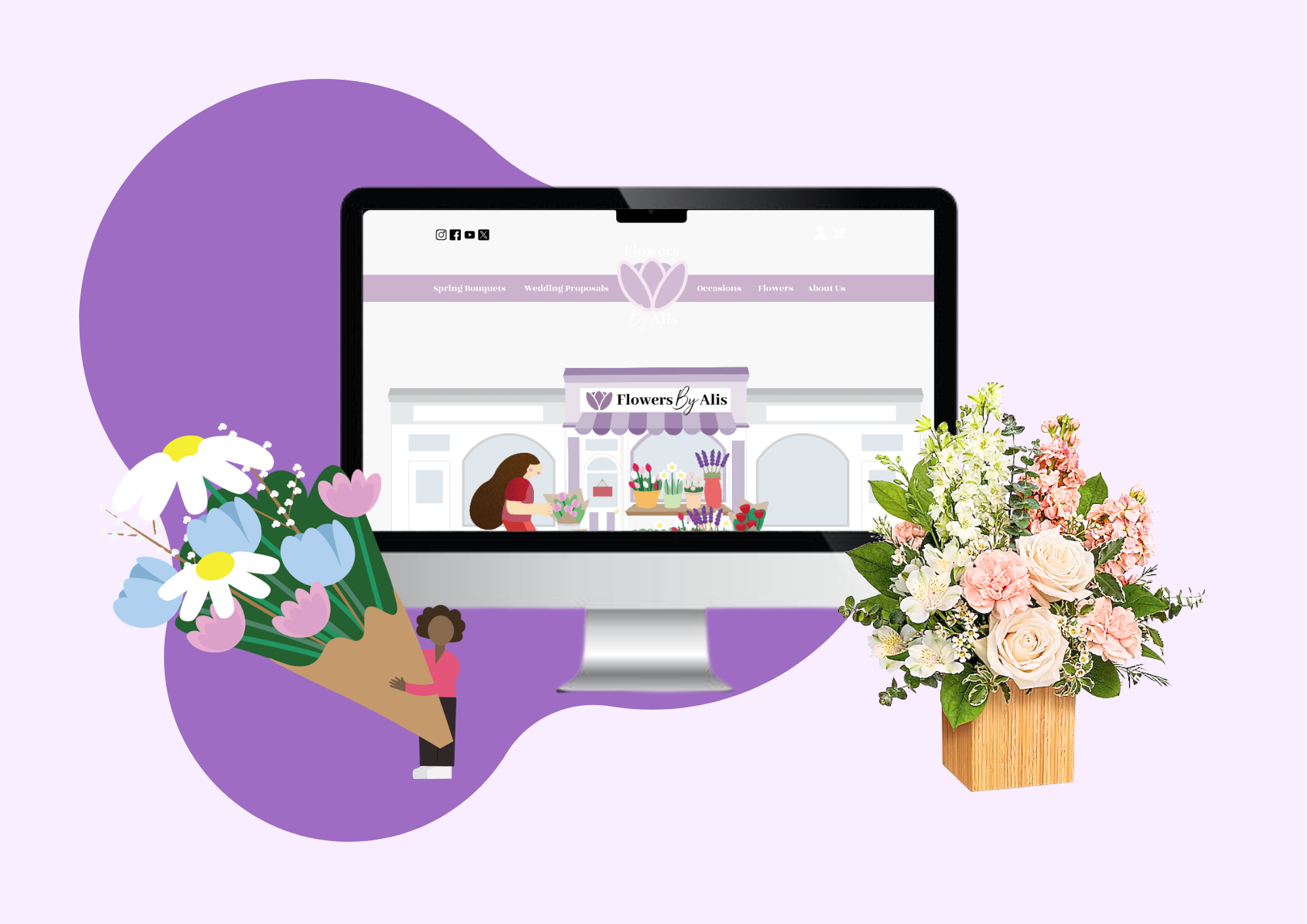
Flowers By Alis is dedicated to providing the highest quality floral arrangements and gifts, ensuring each creation is crafted with care, creativity, and attention to detail. With a passion for floral artistry, the shop takes pride in offering a wide selection of fresh, vibrant flowers suited for every occasion, from joyous celebrations like birthdays and anniversaries to meaningful events such as weddings and heartfelt sympathy tributes.
Problem
The Flowers By Alis website provides a functional user experience with a diverse product selection and a working interface. However, there are opportunities to improve overall usability and user engagement. Enhancements in areas such as site navigation, organization, visual clarity, and interactive elements could create a more seamless and intuitive browsing experience for users. How can I update the website with a refreshed interface that maintains its existing design language while improving functionality through enhancements in organization and interactive elements?
Goal
As a designer, my primary goal is to create a visually compelling and cohesive website that not only captures the essence of the brand but also resonates with its target audience. Through thoughtful branding and strategic web design, I aim to establish a strong visual identity that enhances the overall aesthetic appeal and leaves a lasting impression on visitors.
Beyond aesthetics, functionality is just as important. That’s why I focus on UX/UI design to ensure the website is intuitive, user-friendly, and efficient. By implementing user-centered design principles, I strive to enhance navigation, streamline interactions, and improve accessibility, ultimately providing a seamless and engaging experience for users. My approach is a balance of creativity and usability, ensuring that every design choice serves a purpose—making the website not only visually stunning but also highly functional and easy to use.
01. User Research
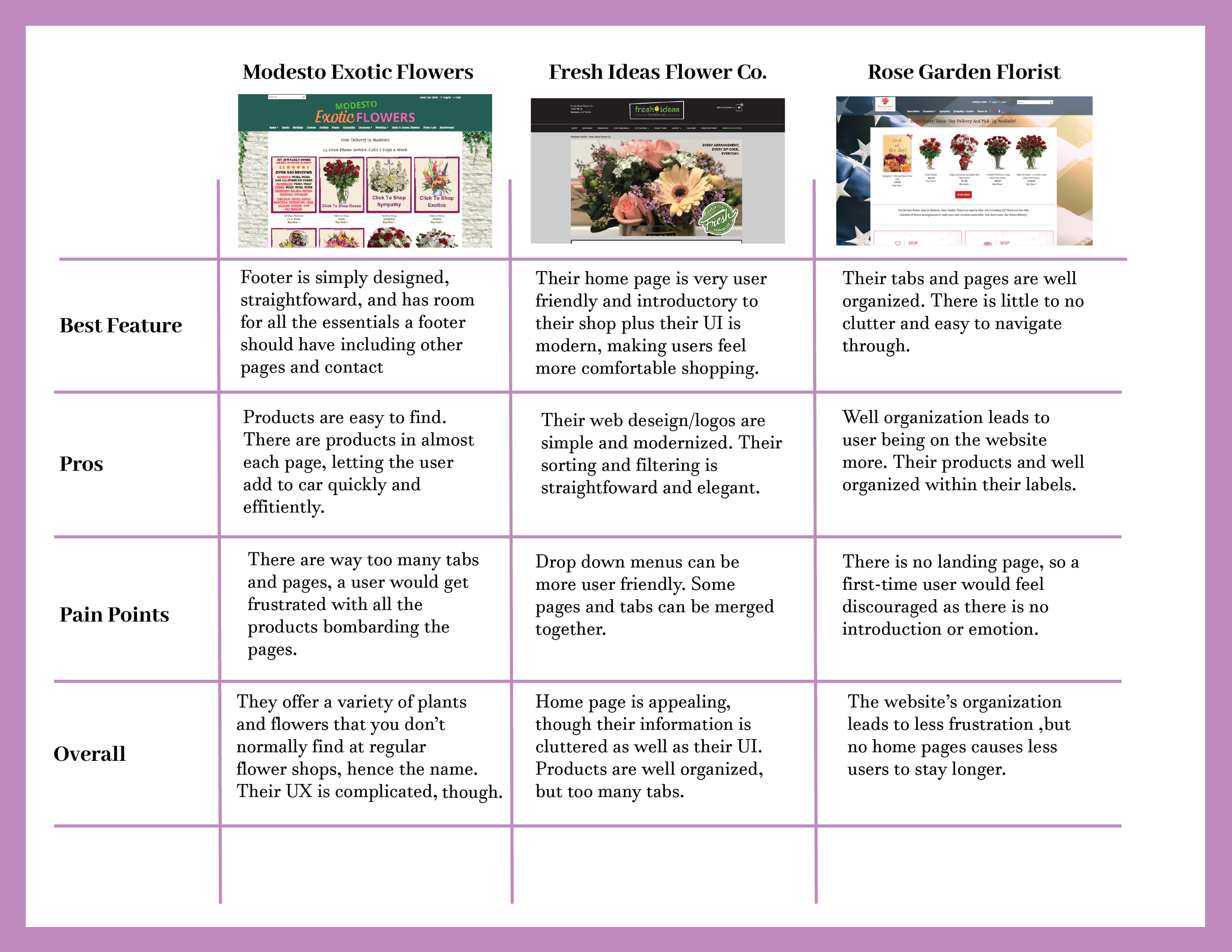
I decided to research other flower shops to gain a broader understanding of how they operate and the key functions they serve. Through my research, I found that most flower shops prioritize providing a seamless and convenient online shopping experience for their customers. Naturally, they want to make the purchasing process as easy as possible through their websites.
However, one aspect that stood out to me the most was the sheer number of products displayed on each page. These shops make a strong effort to showcase their full range of offerings, ensuring customers can see all available options. While this approach is beneficial, it can sometimes lead to a cluttered browsing experience. Designing a way to present all options in a more organized, visually appealing, and functional manner will ultimately enhance user experience and lead to increased customer engagement and sales.
Competitive Analysis
Key Takeaways
Having an introductory homepage, large horizontal groups, and well organization throughout the website builds a good foundation.
User Research + Interviews
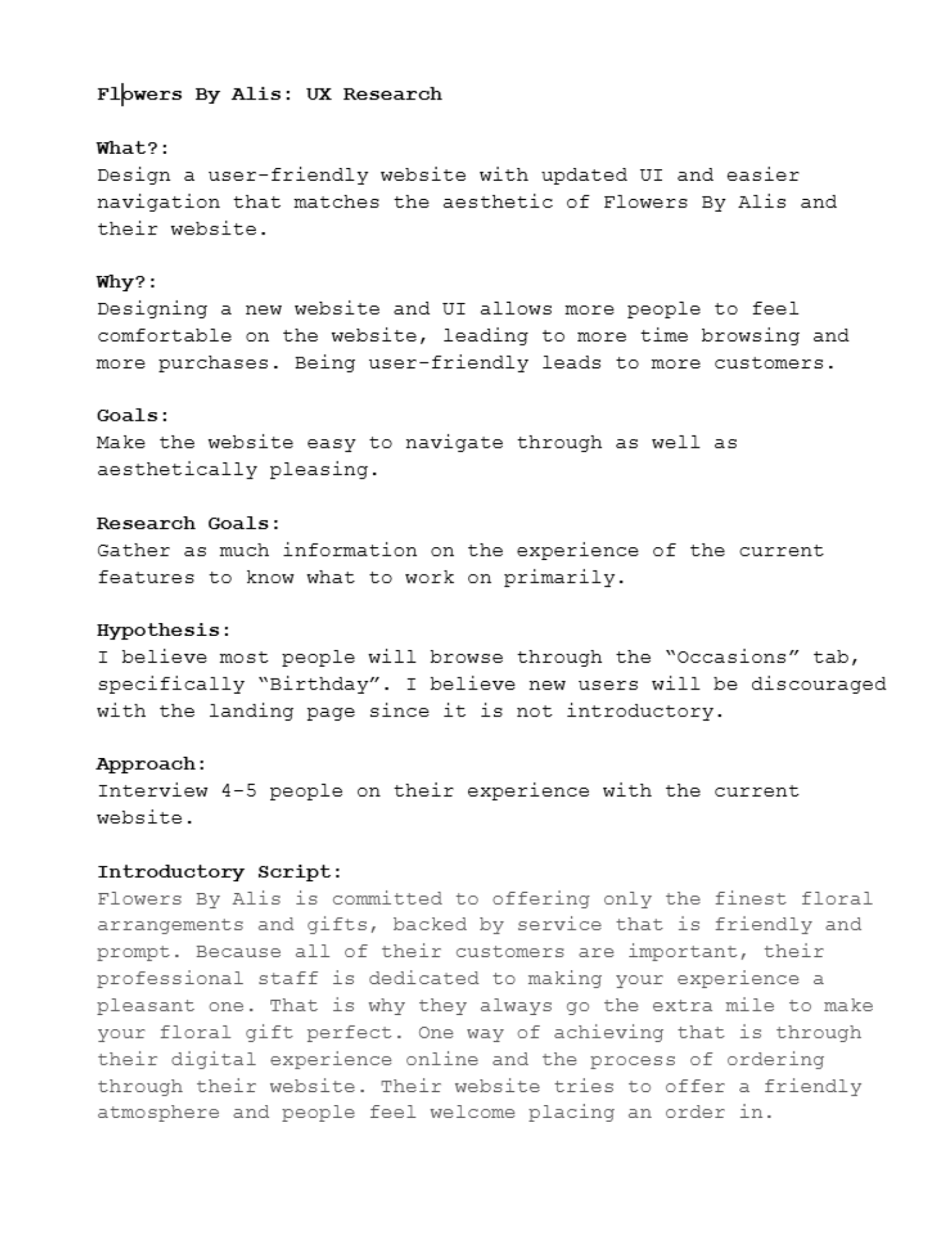
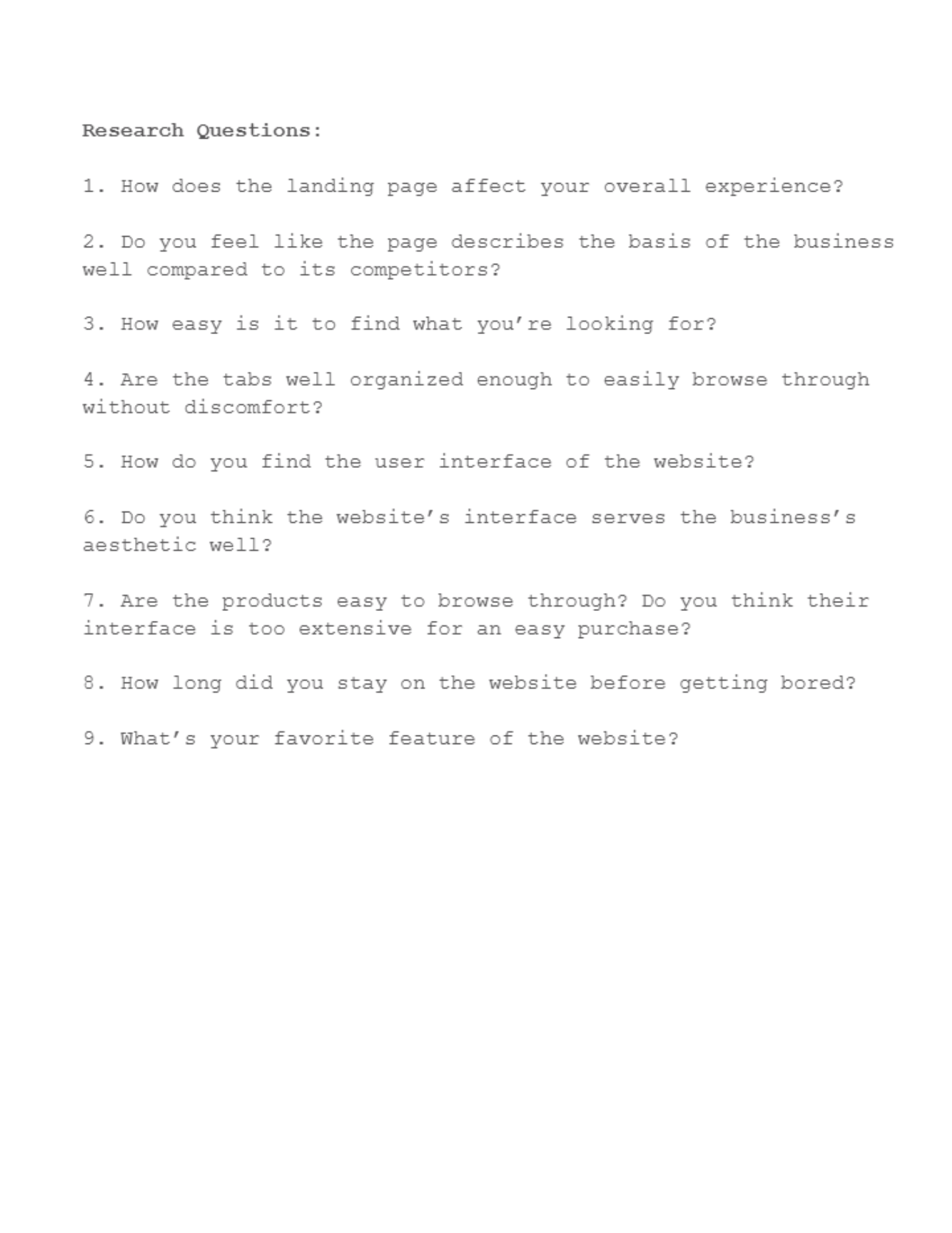
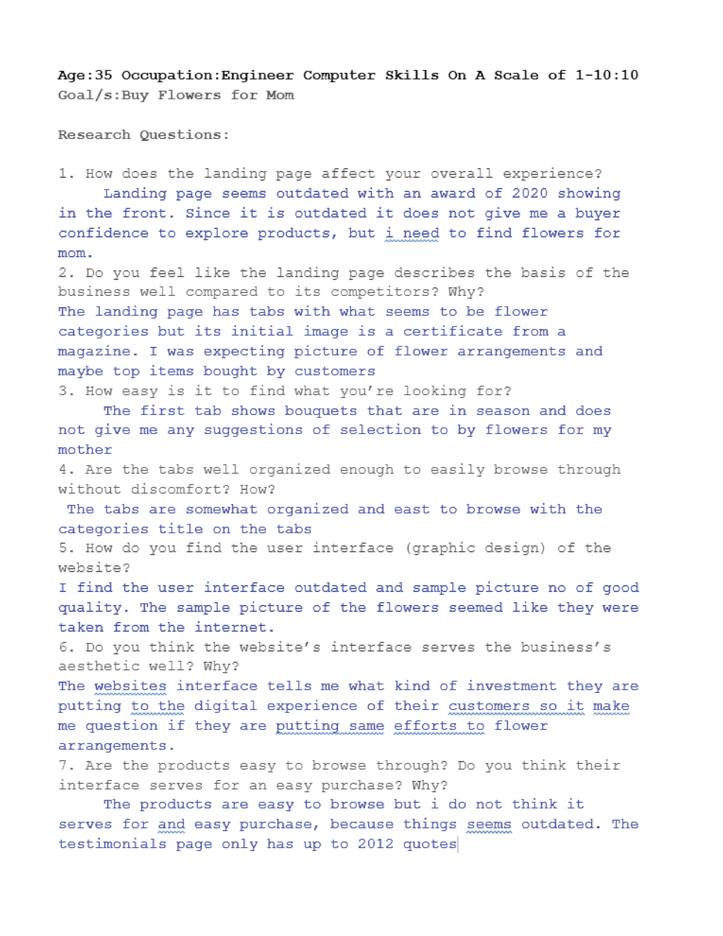
I decided to conduct research within my family and friends on the current website to gain insights into how users interact with it and to determine whether others shared similar thoughts and ideas about its design and functionality. By analyzing user behavior, feedback, and pain points, I aimed to identify common trends and areas for improvement.
This research allowed me to assess whether my initial assumptions aligned with real user experiences and expectations. By gathering data from various sources, including user reviews, heatmaps, and usability testing, I was able to understand how visitors navigate the website, what aspects they find intuitive, and where they may encounter challenges. Identifying these patterns helped me refine my design approach, ensuring that any proposed changes would address actual user needs while enhancing the website’s overall usability and effectiveness.
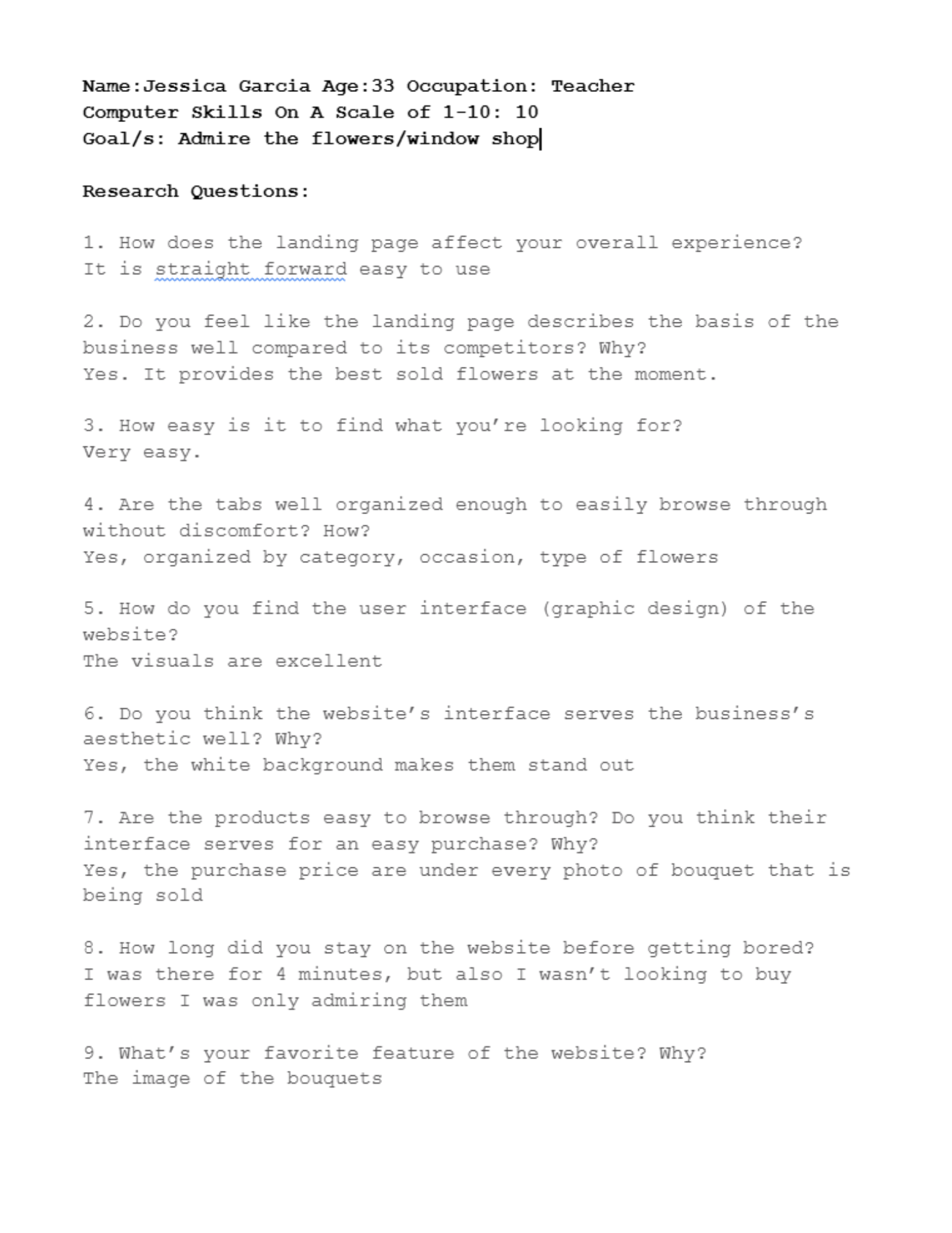
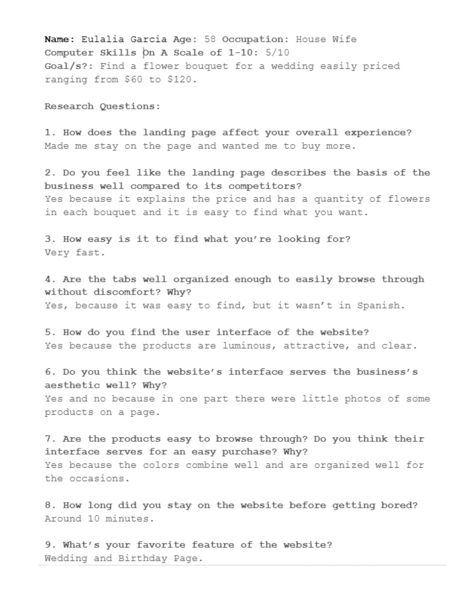
Key Takeaways
Most users found the website easy to navigate and enjoyed browsing through the products. The high-quality images particularly intrigued them, drawing interest in the floral arrangements. However, despite this initial engagement, the time spent on the website was surprisingly short. Many visitors left quickly, suggesting a need for improvements in user engagement and retention. Enhancing interactive elements, refining the layout, and adding compelling calls to action could encourage users to stay longer and explore more.
User Personas + Empathy Map
Key Takeaways
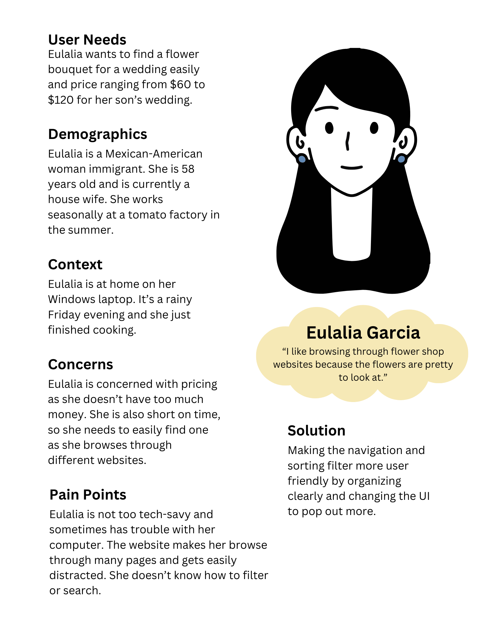
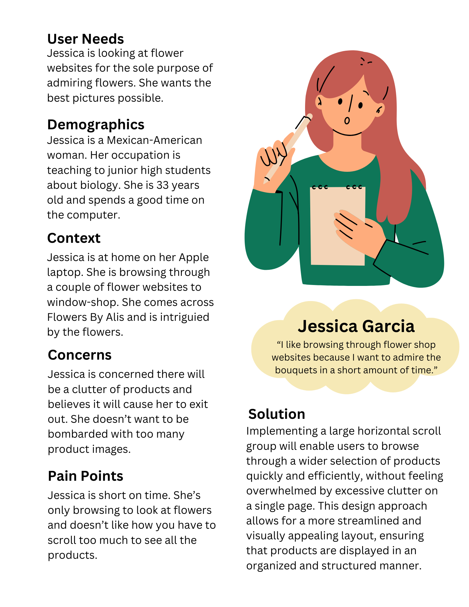
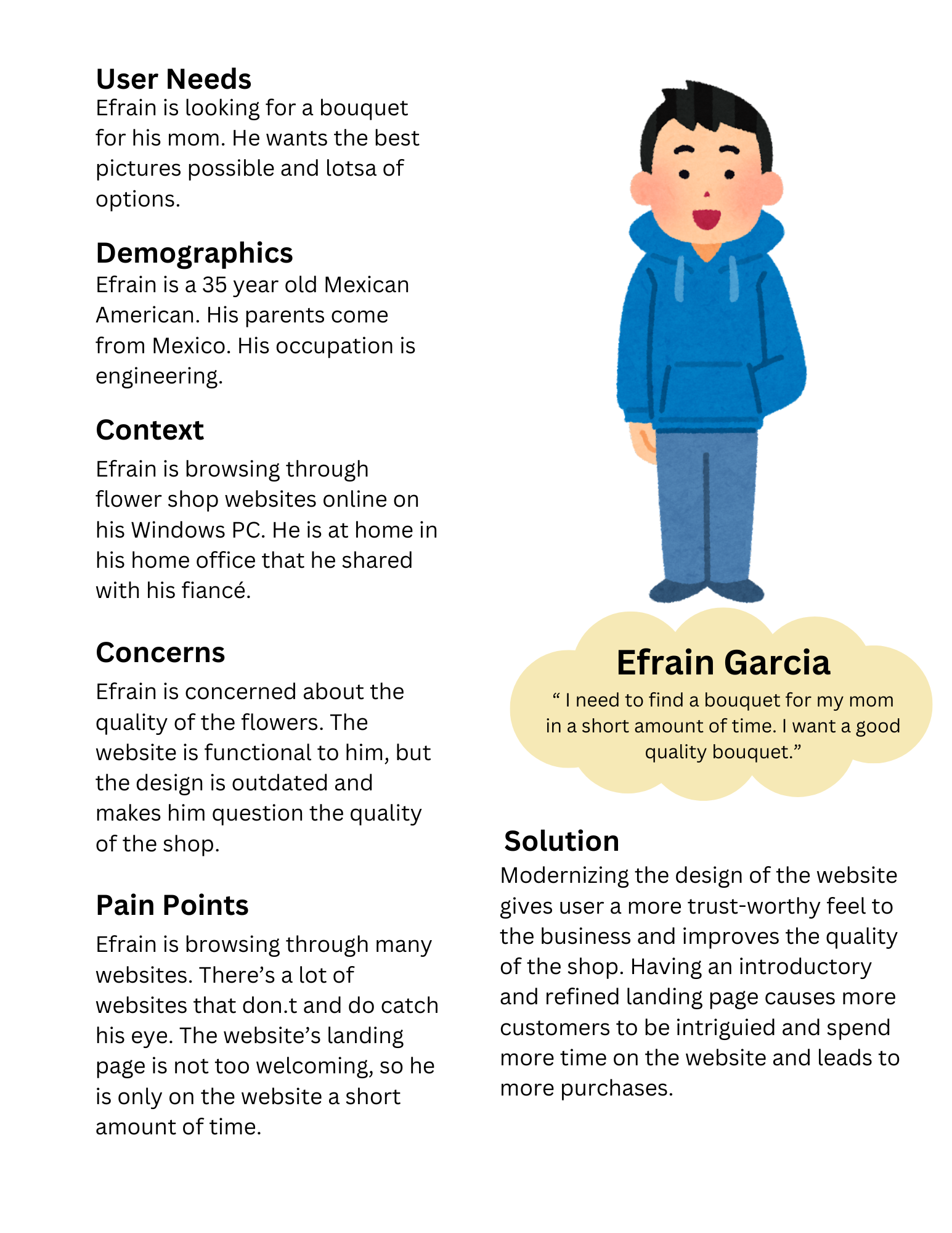
My ideal user persona is Eulalia Garcia, who represents the target audience with specific needs, concerns, and pain points. Understanding her experience helps identify challenges and inspire solutions to improve usability, navigation, and overall engagement on the website.
Empathy Map
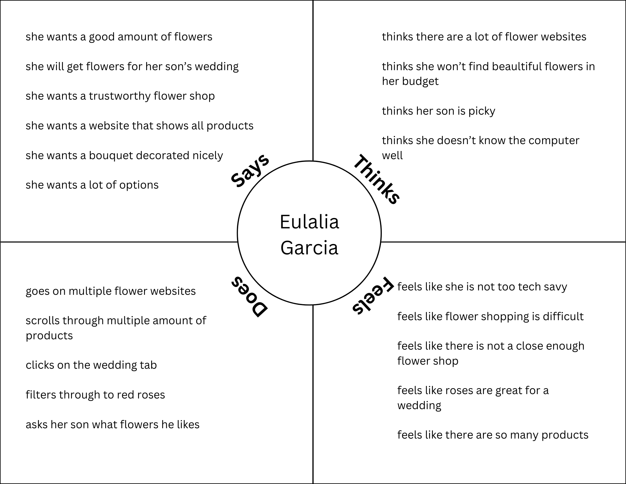
An empathy map is a visual tool designed to help gain deeper insight into the user's thoughts, emotions, and behaviors. By breaking down the user's experience into four key quadrants—what she says, thinks, does, and feels—this map allows for a more comprehensive understanding of her motivations, pain points, and desires.
I decided to research other flower shops to gain a broader understanding of how they operate and the key functions they serve. Through my research, I found that most flower shops prioritize providing a seamless and convenient online shopping experience for their customers. Naturally, they want to make the purchasing process as easy as possible through their websites.
Research Key Findings
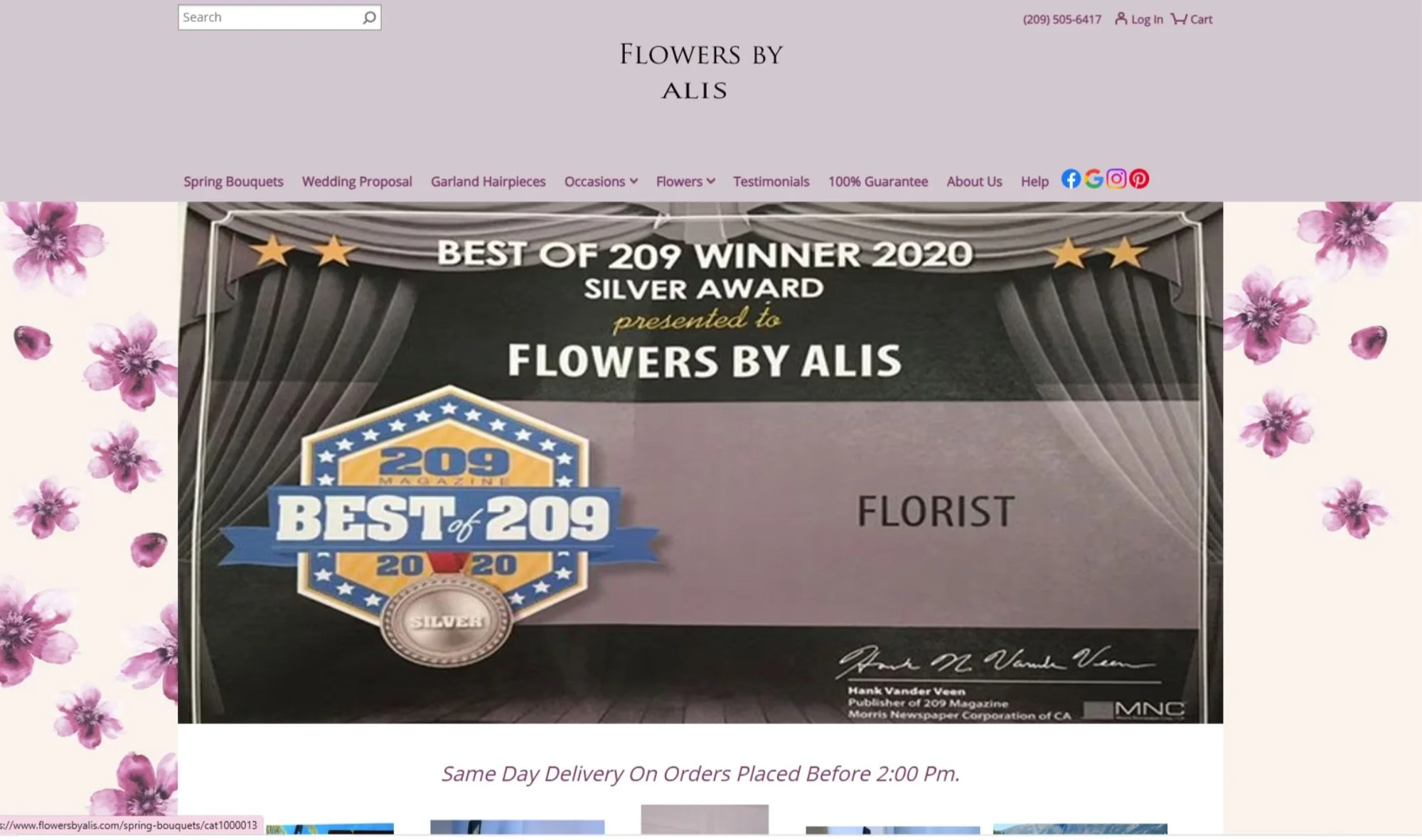
Through my user research and interviews, I discovered that most users already find the website easy to navigate. This indicates that the current structure is effective and should be preserved where possible. To maintain familiarity and usability, I plan to retain key elements in my redesign, such as the Spring tab and the website's established color scheme. By keeping these essential features intact, the redesign process will be more seamless, ensuring a smoother transition for existing users while incorporating necessary improvements to enhance functionality and user experience.
Now that my research has been conducted and I’ve synthesized my data, I have to analyze the problem to make sure it is validated, meaning: is it important and do users actually experience it?
I have developed a clear understanding of my ideal user persona by creating an empathy map that highlights their experiences, thoughts, emotions, and behaviors while navigating the website. This process allowed me to pinpoint key pain points, motivations, and needs that shape their interaction with the platform. Additionally, I have gathered insights from other users by conducting interviews, surveys, or usability testing to gain a broader perspective on how different users engage with the website. By combining these findings, I can identify common patterns, validate assumptions, and refine the user experience to better align with their expectations and needs.
Problem
How can I update the website with a refreshed interface that maintains its existing design language while improving functionality through enhancements in organization and interactive elements?
Problem Validation
02. Branding/Visual Identity
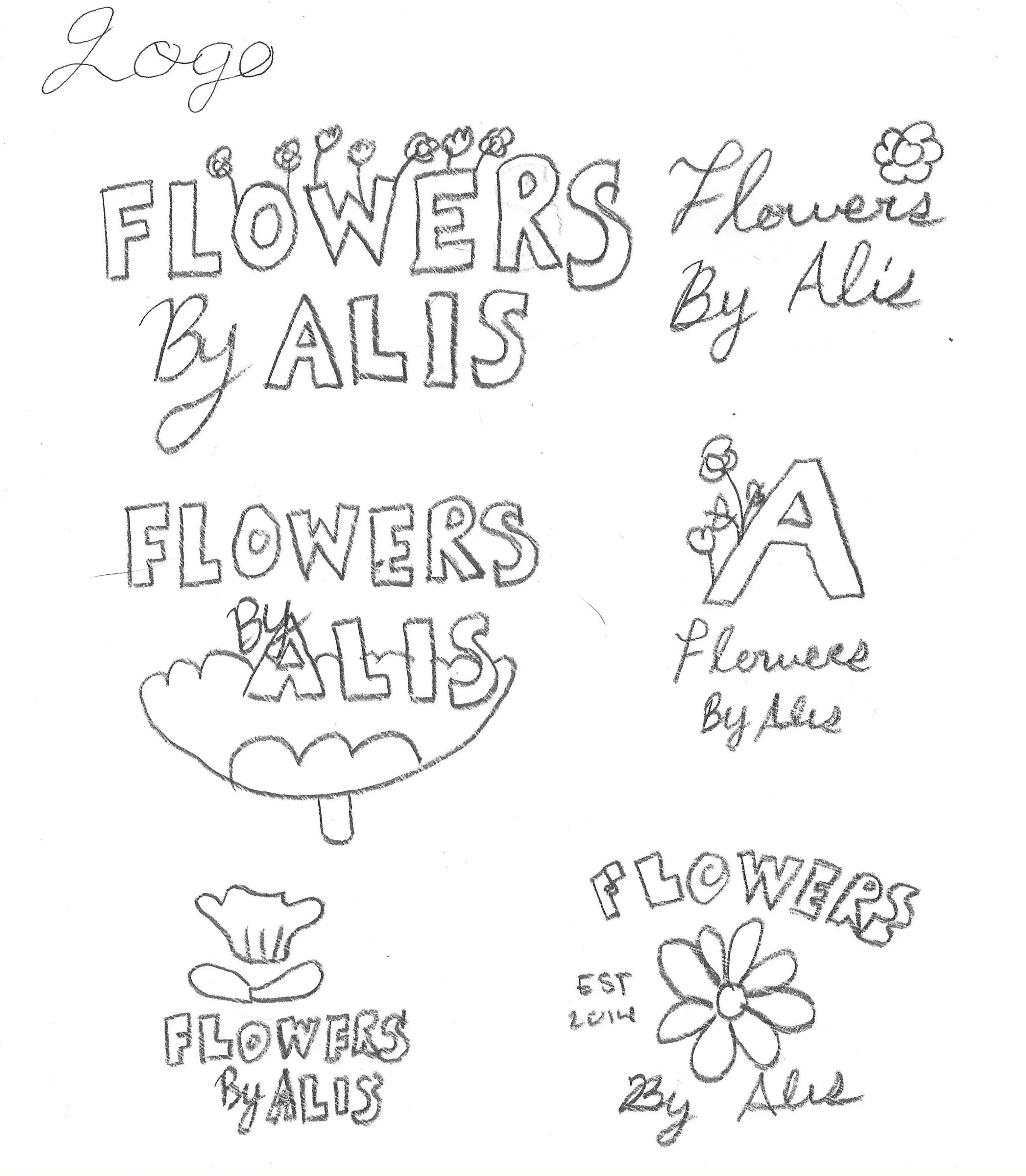
To bring these ideas to life, I started with some rough sketches, quickly jotting down different concepts to visualize potential designs. These early drafts help me experiment with composition, typography styles, and floral elements, ensuring that the final logo aligns with the brand’s personality while remaining modern and appealing to users.
Style Tile/Mood Board
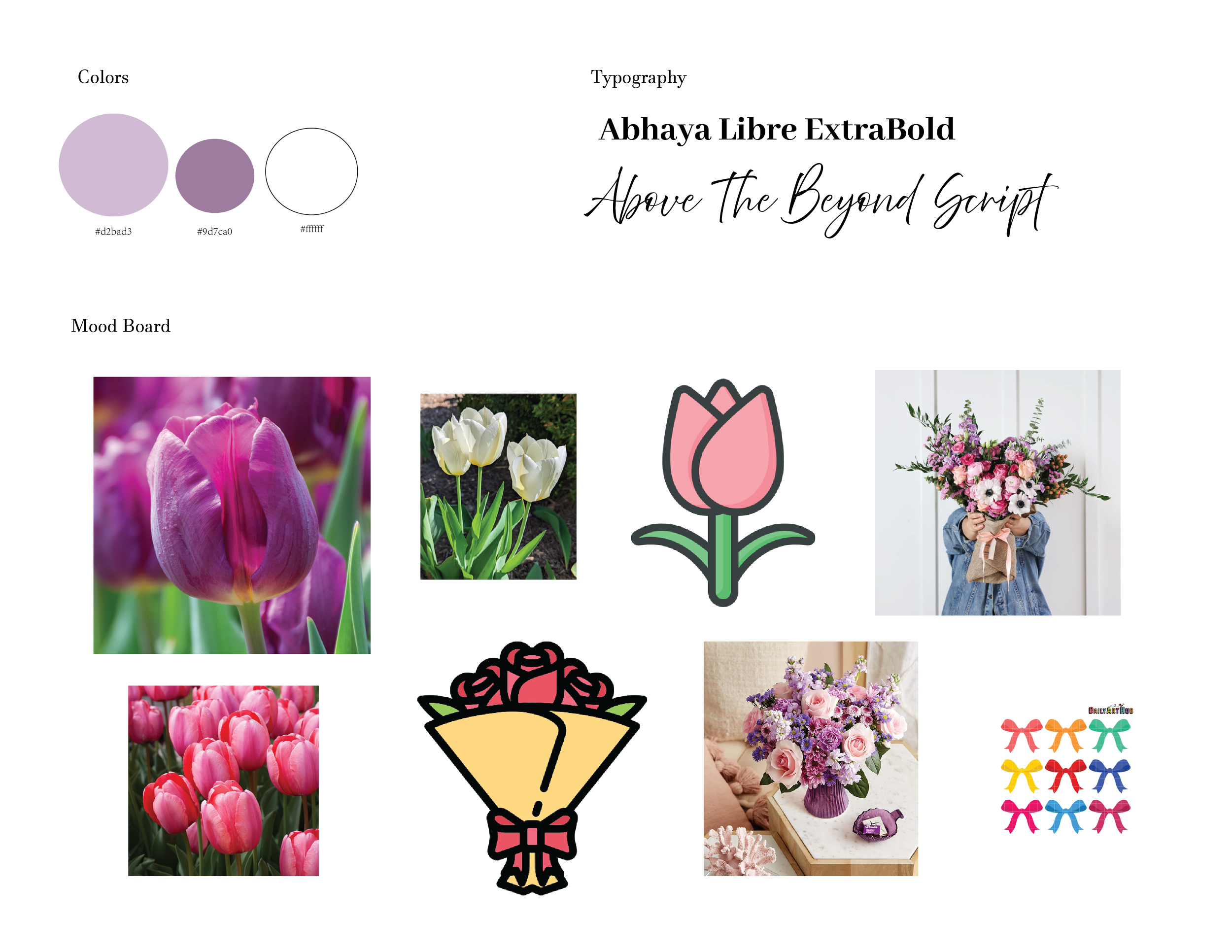
I finalized the color scheme and typography while keeping the overall website design in mind to ensure consistency and cohesiveness. I chose a purple color scheme as a foundation since the original website already features purple in its header.
For typography, I first chose a serif font to establish a sense of sophistication and readability, ensuring that the text remains clear and professional. To add a touch of elegance and glamour, I paired it with a script font, which introduces a graceful and refined element to the design.
Logo Exploration
Logo
Given that Flowers By Alis currently has a simple text-based logo, I wanted to create a more visually engaging representation of the brand. To better capture the essence of the business, I explored incorporating floral illustrations that reflect the company's identity and offerings. Additionally, I considered selecting a new typography that complements the floral elements, enhancing the overall aesthetic and making the logo more distinctive and memorable.
Sketches
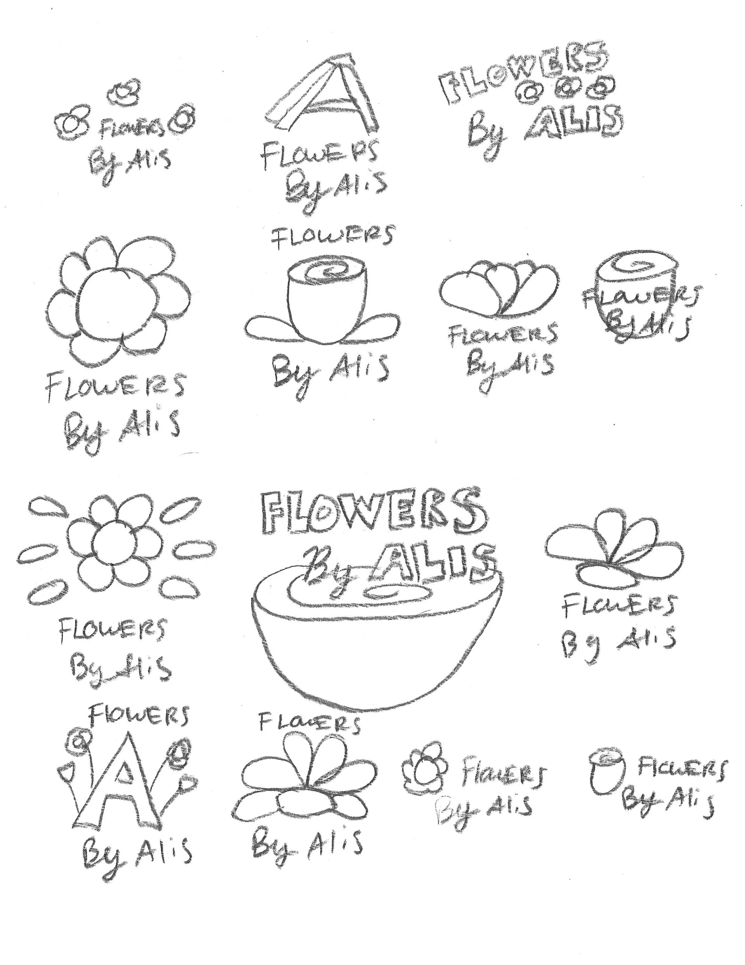
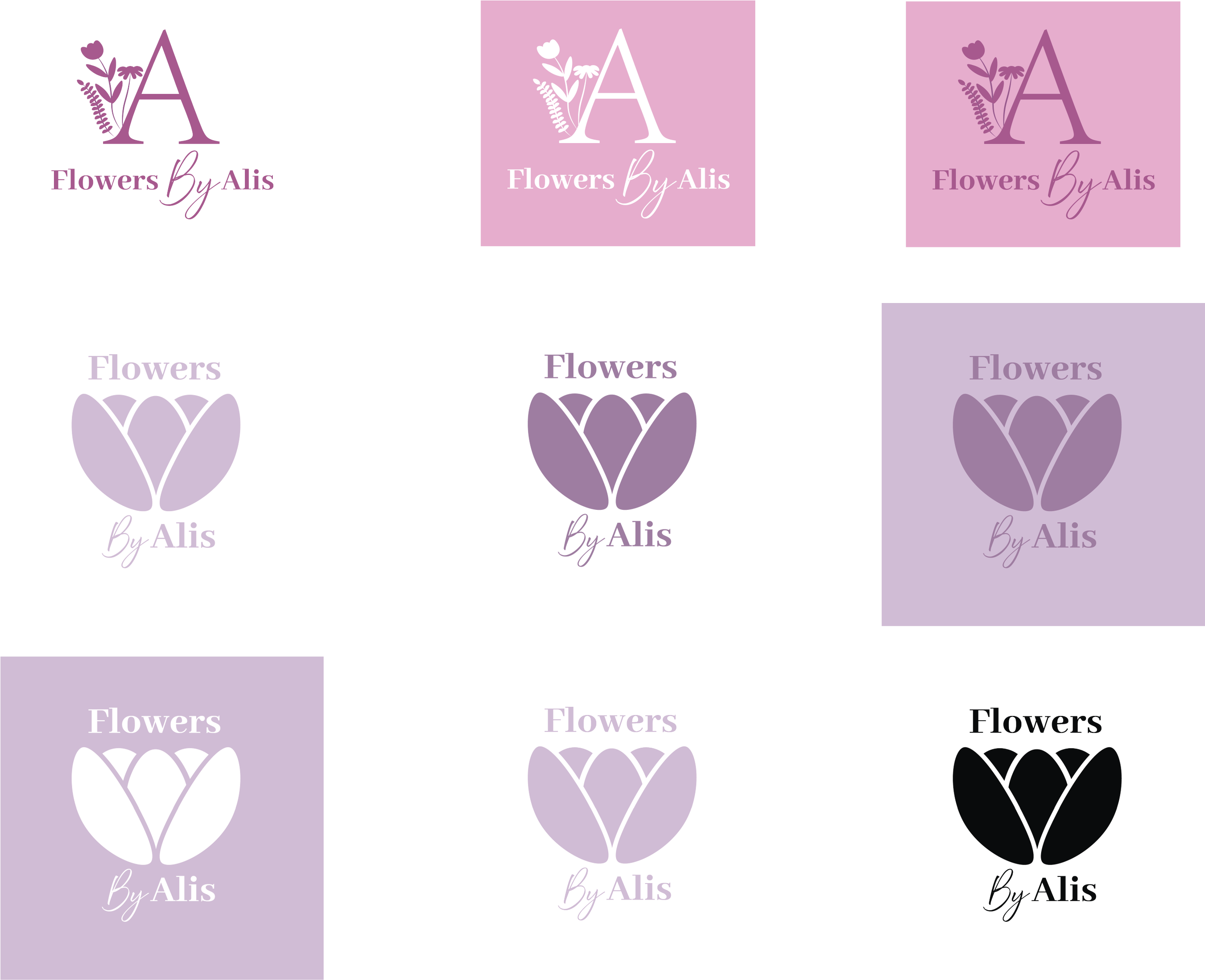
I selected two logo concepts to refine further in Adobe Illustrator, allowing me to experiment with different design elements. While exploring variations in the color scheme, I maintained consistent typography to ensure a cohesive look.
I chose the first design because I liked the idea of flowers subtly peeking through the bold "A," symbolizing the shop's wide variety of floral arrangements while maintaining a clean and structured aesthetic. The second design stood out for its close-up depiction of flowers, creating a more vibrant and eye-catching visual that immediately communicates the essence of the shop. This approach makes the floral theme more prominent and clearly reinforces the brand’s identity.
Final Logos
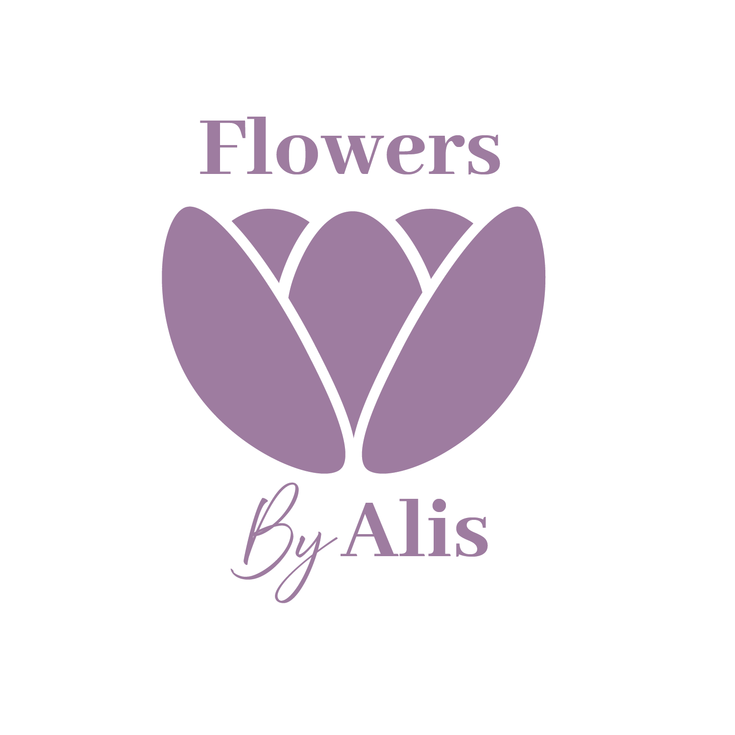
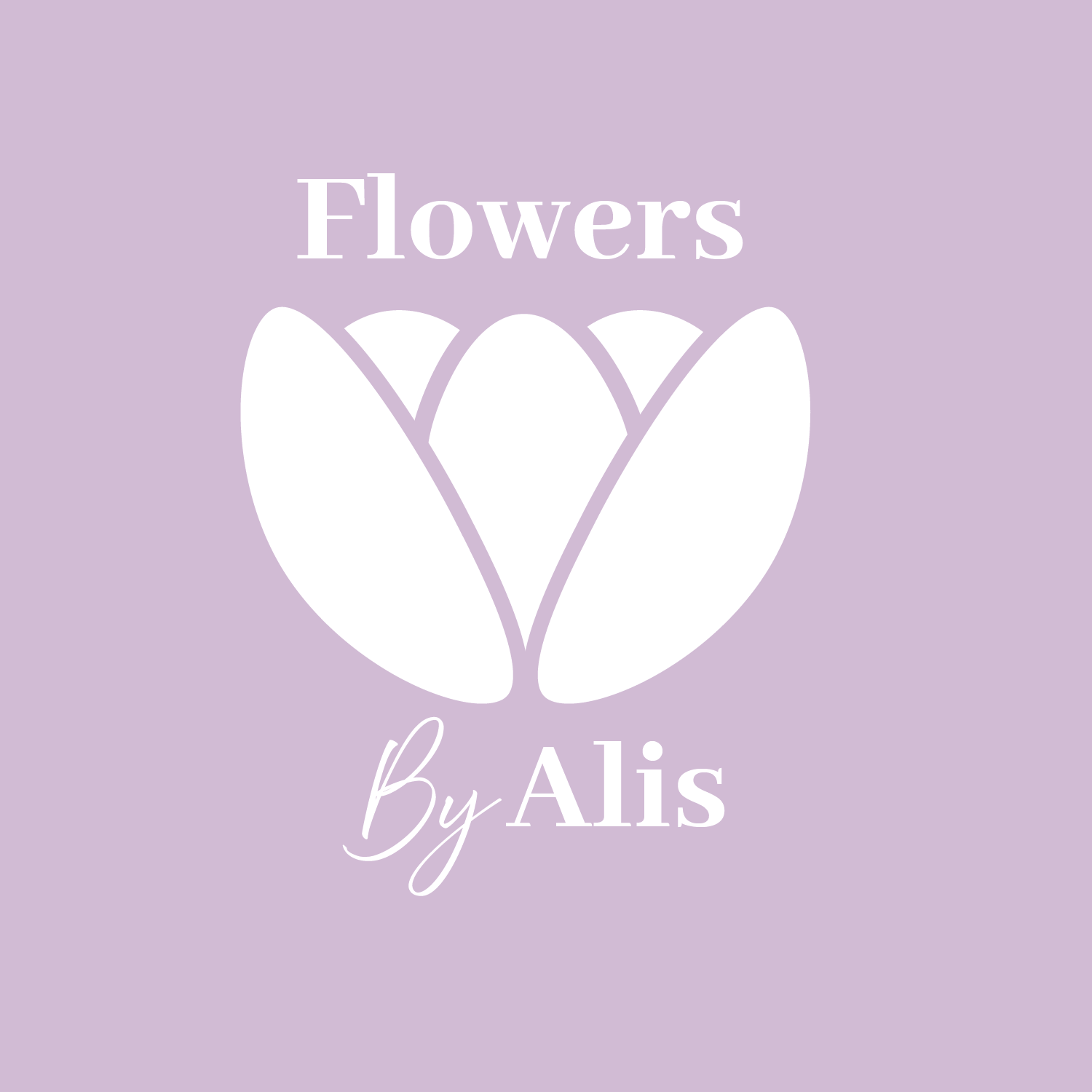
I ultimately decided that the second design best represents the business, as its simplicity effectively conveys the brand’s identity while maintaining a sense of elegance. The clean and straightforward design ensures that the logo remains easily recognizable and visually appealing without unnecessary complexity.
Additionally, this design aligns seamlessly with the current website's aesthetic, which balances minimalism and glamour. By complementing the existing sophisticated yet understated look of the website, the logo enhances the brand’s overall visual consistency.
Home Page Illustration
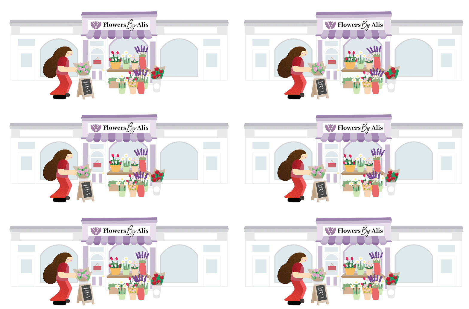
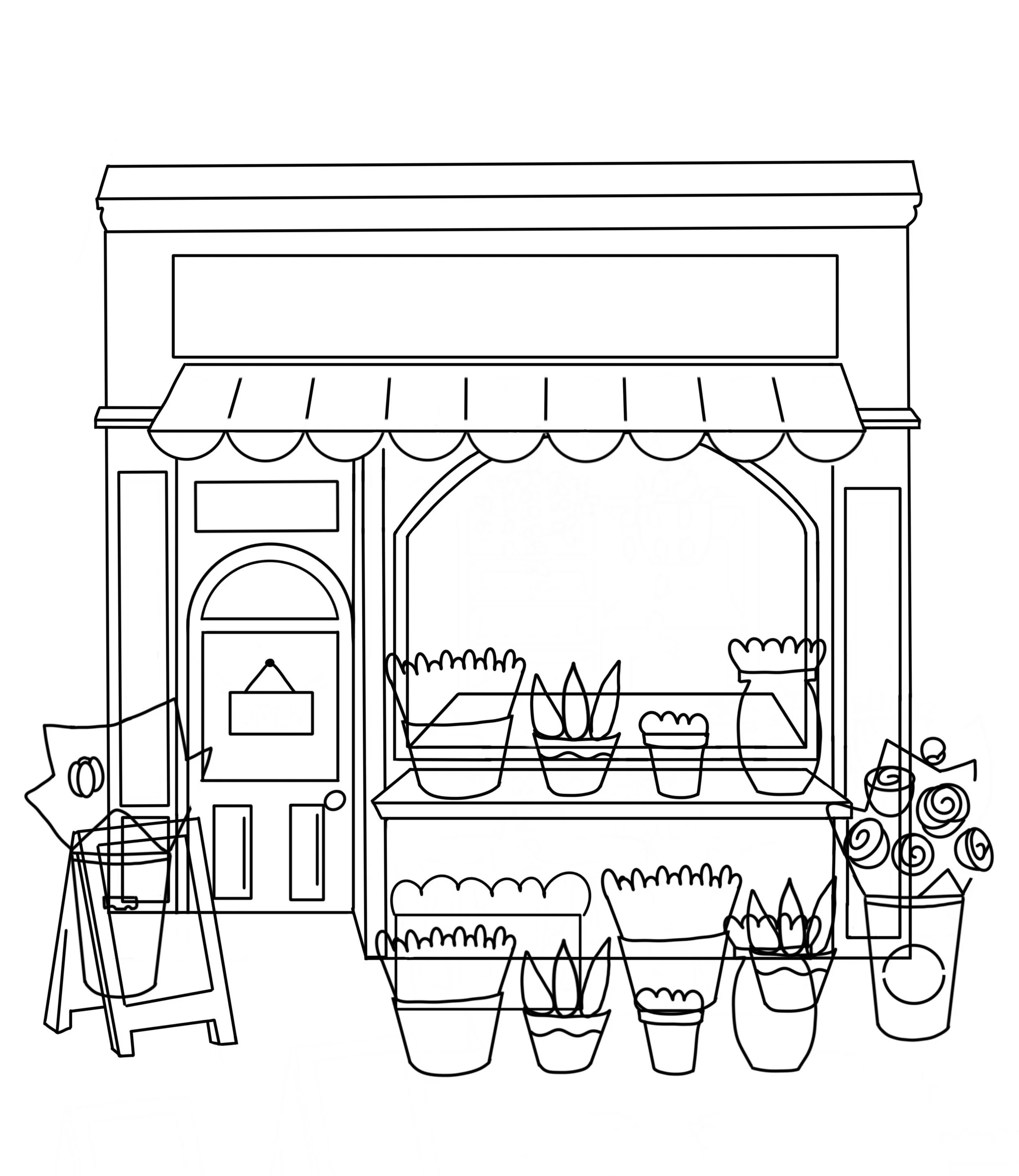
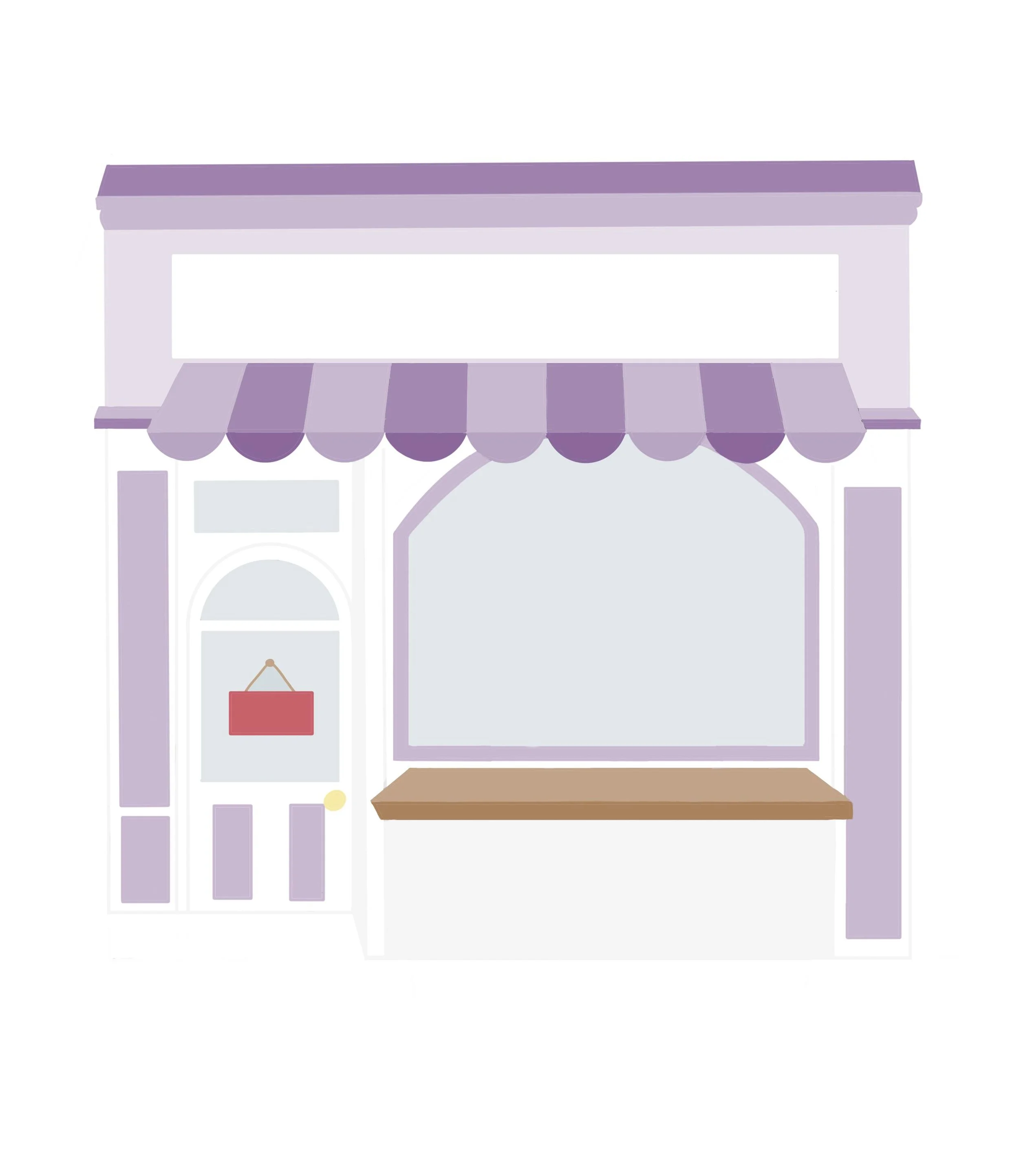
For the home page, I wanted to establish the brand using a bold and inviting illustration that captures users' attention at first glance. The visual component not only sets the tone of the brand but also creates a warm and inviting first impression, especially with the motion design. Using bright colors and organic shapes, the illustration provides a more inviting and dynamic overall user experience with the interface being more dynamic and accessible. The goal is to provide a friendly and inspirational ambiance, to which guests feel comfortable coming forward to discover more.
Outlines
UI Kit
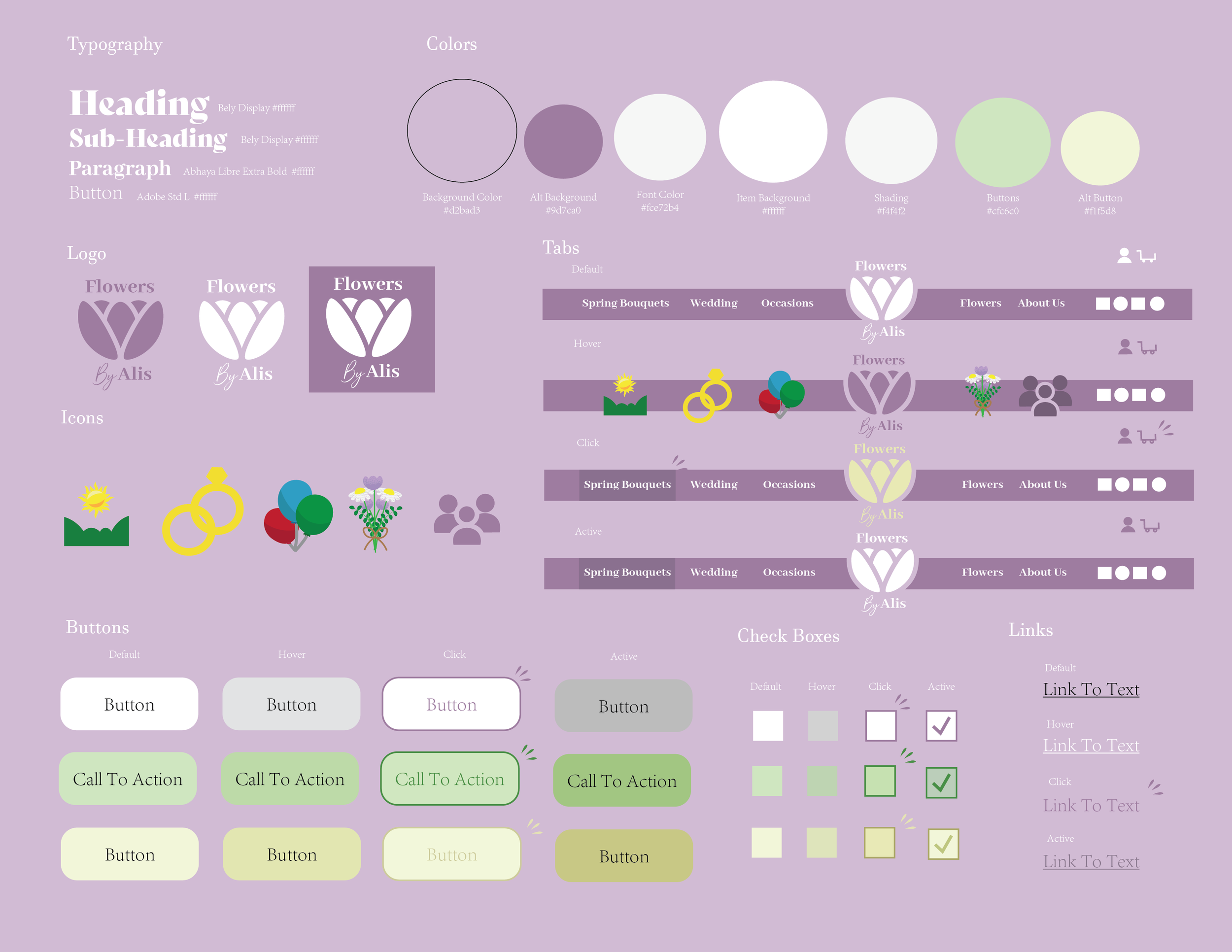
I created a UI Branding Kit that outlines the visual identity of the flower store: color schemes, typography, illustrations, and other design elements. For typography, I chose an elegant yet classic typeface to express the delicate and sophisticated nature of the brand. Since this is a floral shop, I wanted the design to instill a sense of beauty and elegance yet maintain high readability in typography.
I chose a color palette of purple and light purple hues to convey creativity, calmness, and elegance. In addition, I added bright accent colors for buttons, interactive elements, and links, making them vibrant and standing out. This improvement to usability is reflected in the design, thus, enabling a bright and cheerful interaction for the users.
03. Website Design
Site Map
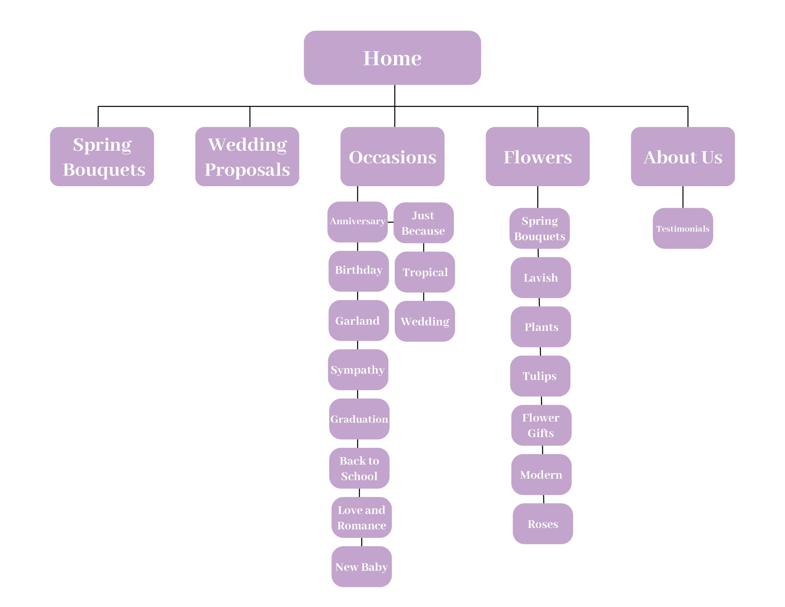
Creating this site map was somewhat challenging due to the numerous categories for occasions and flowers. To improve clarity and organization, I carefully selected the most important categories and merged some that overlapped, ensuring the choices were more distinct and user-friendly. The other sections of the site map were more straightforward to structure, as their purposes were clearer. However, I also had to remove certain existing pages that didn’t justify being standalone sections. These pages contributed to unnecessary clutter in the navigation, and consolidating them helped create a more streamlined and intuitive browsing experience
User Flow
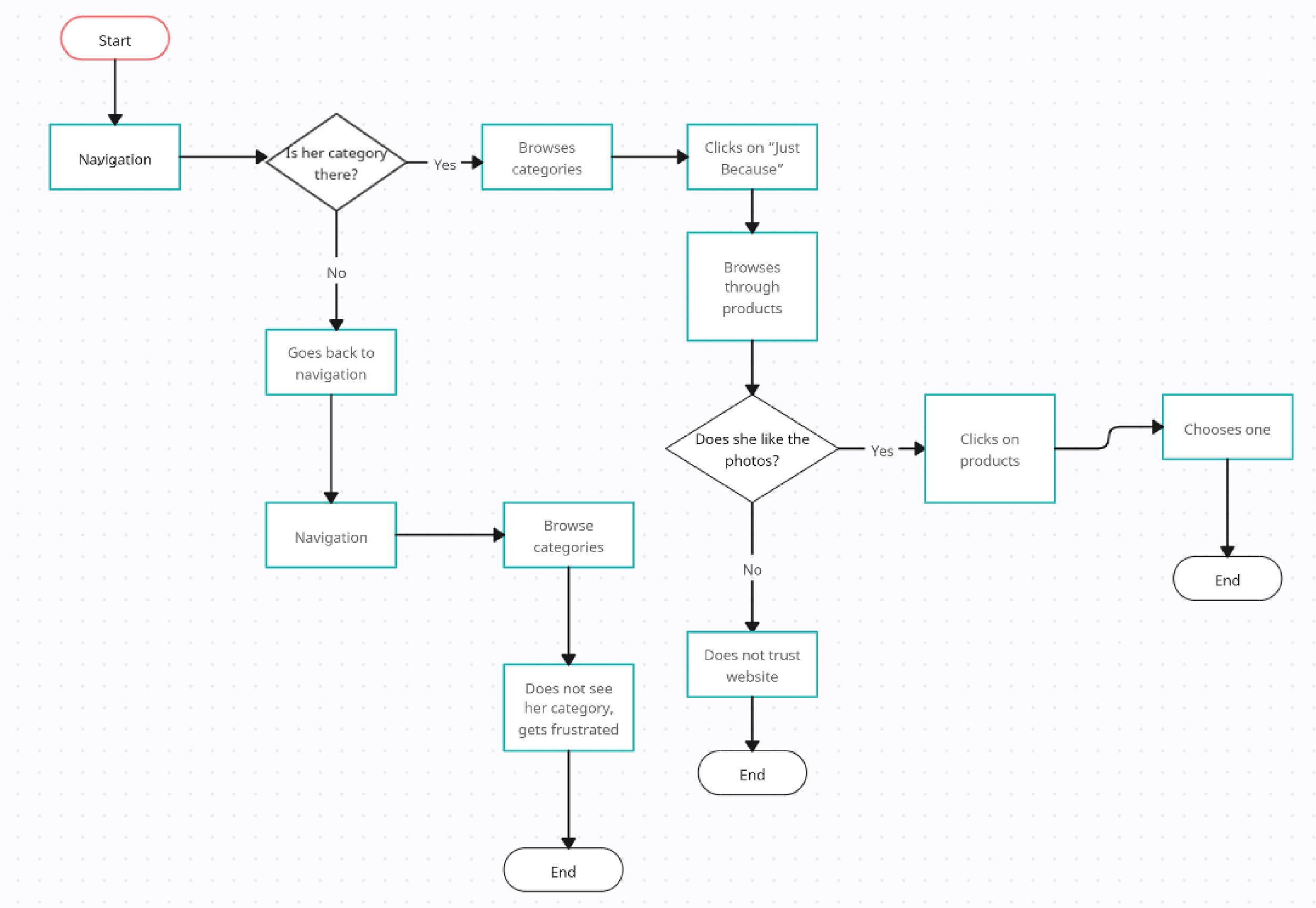
This was my first time creating a user flow, so it was a bit challenging. However, the process allowed me to gain a deeper understanding of my user persona, Eulalia Garcia. As I mapped out the steps she would take to achieve her goal, I considered different possibilities and potential obstacles she might encounter along the way. This helped me think more critically about her needs, motivations, and decision-making process, ultimately making the user experience more intuitive and seamless.
Low Fidelity Wireframes
Desktop
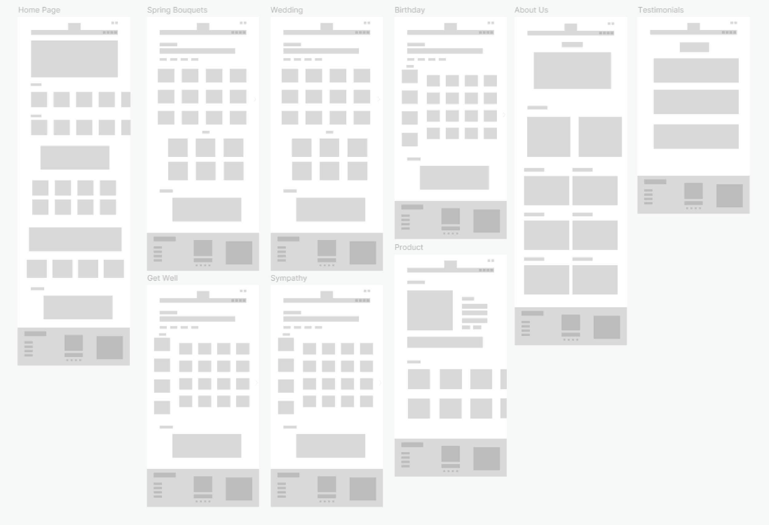
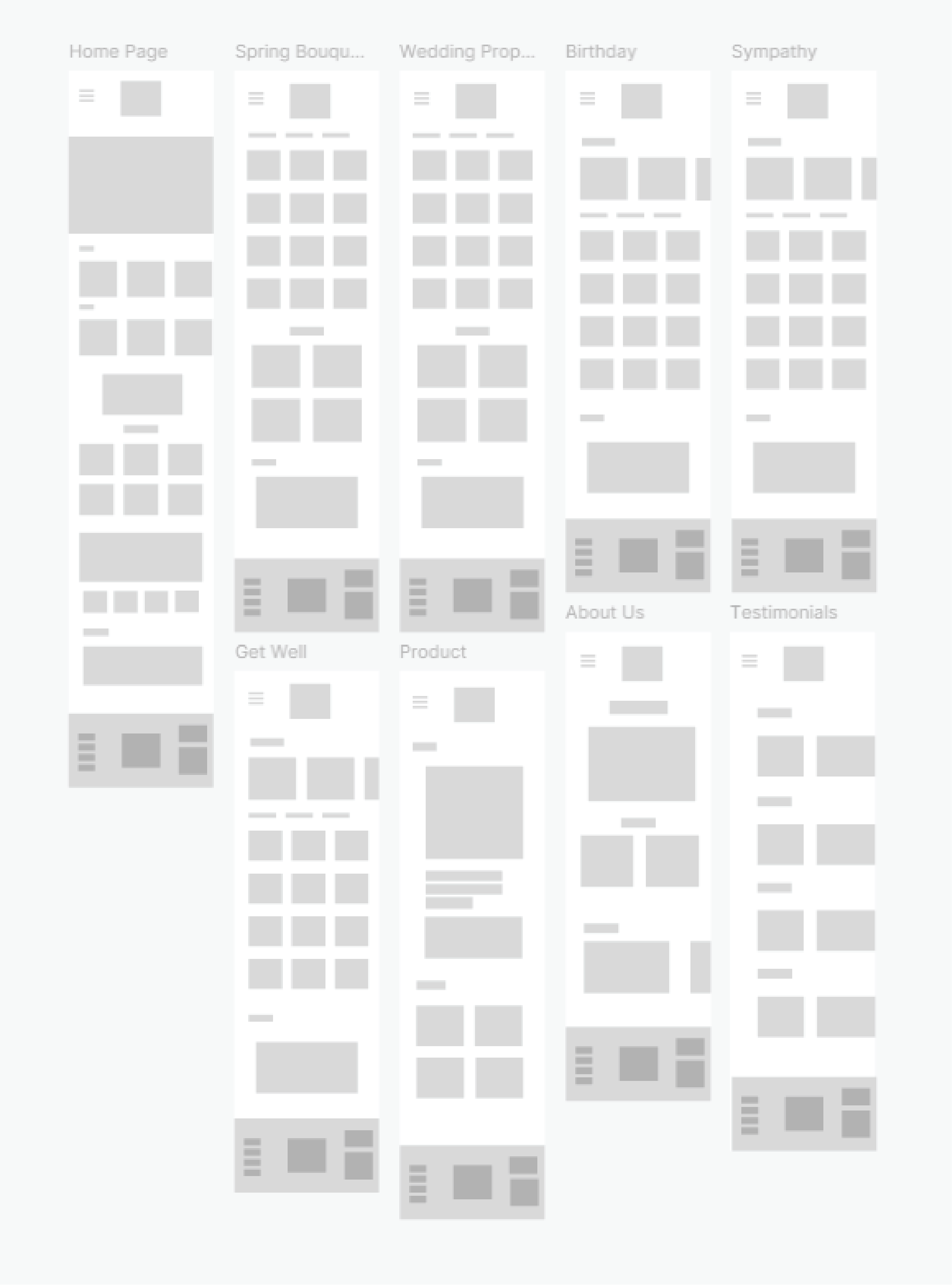
These are very rough lo-fi wireframes, intentionally kept simple to allow for greater flexibility when refining the UI in my high-fidelity wireframes. By keeping them rough at this stage, I give myself more creative freedom to explore different design possibilities without being too constrained by details too early in the process. However, despite their rough appearance, these wireframes serve as a strong foundation, clearly outlining the core structure and essential features that will be carried into the final prototype.
Mobile
High Fidelity Wireframes
Desktop
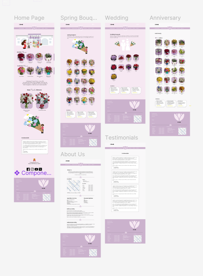
These are very rough lo-fi wireframes, intentionally kept simple to allow for greater flexibility when refining the UI in my high-fidelity wireframes. By keeping them rough at this stage, I give myself more creative freedom to explore different design possibilities without being too constrained by details too early in the process. However, despite their rough appearance, these wireframes serve as a strong foundation, clearly outlining the core structure and essential features that will be carried into the final prototype.
Mobile
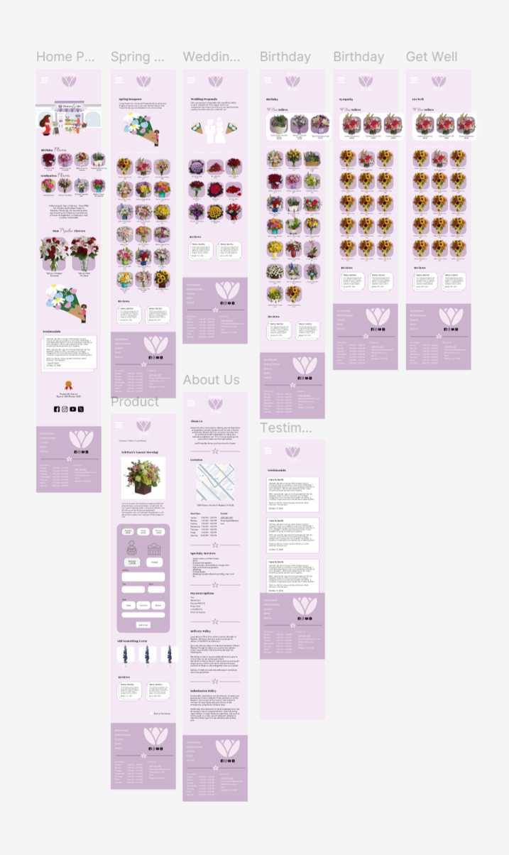
Website